Welcome to part two of Urbantyping's Stroll Around Soho. If you missed part one you can find it here.
Like all good things, the last post finished with a trip to the pub. After a quick beer and a bizarre staring match with a bloke pressing his face against the window we headed back out to find another pub search for more exciting typography.
Straight out of the door and across D'Arblay Street we spotted the entrance to Wardour Mews, a narrow cul-de-sac of old warehouse buildings with a surprisingly colourful past.
According to Herb Lester Associates, the mews was home to a selection of infamous clubs and coffee bars in the sixties such as The Casino, The Take Five, The Granada and The Limbo Club. An interview with DJ Amanda Evans at Shottin.com revels that visitors to the latter included Elizabeth Taylor, Richard Burton and Bob Marley!
Disappointingly, there wasn't much typographic evidence of this exciting past to be found in the mews, though there was the handpainted sign (above) and this intriguing old stencilled notice (see below). Sadly, it seems that life here is a lot quieter these days, but if these walls could talk...
The next find was this beautiful hand painted wooden sign in the entrance to Portland Mews, where R.N.Cattle's firm of woodworkers were based. Although there seems to be little information available about the company the sign itself has been documented by quite a few excellent London blogs and with all that character it's easy to see why.
A painted sign like this is always going to be special but particular details liked the extended L on Ltd, the italicised type and the crude ampersand give it a human touch and it's great to see it surviving here after all these years.
A painted sign like this is always going to be special but particular details liked the extended L on Ltd, the italicised type and the crude ampersand give it a human touch and it's great to see it surviving here after all these years.
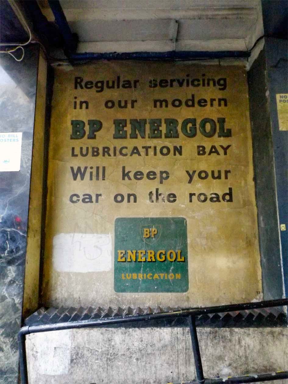
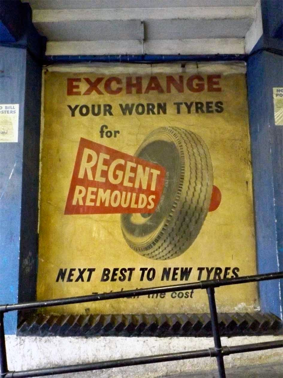
Next up were two of the best preserved ghost signs I've encountered anywhere. Just inside Soho car park these large advertisments for BP Energol and Regent Remoulds (below) sit within alcoves along the entrance ramp. Quite easy to spot from the street, their colour and detail have remained vivid over the years, no doubt due to their sheltered location.
BP Energol is naturally the more familiar of the two, featuring the company's characteristic green and yellow branding, albeit in a chunky uppercase slab serif rather than the slick sans of today. The advertising copy is probably just the right amount to read while driving up the ramp and is spaced generously, no doubt to aid readability while moving.
According to the Vintage Garage website, BP Energol was originally known as Price's Energol and was produced by a company called Price's Patent Candle Co, who were part owned by BP. By 1954 BP had rebranded the product in their own name, which means that the sign can be dated to around that time or later.
According to the Vintage Garage website, BP Energol was originally known as Price's Energol and was produced by a company called Price's Patent Candle Co, who were part owned by BP. By 1954 BP had rebranded the product in their own name, which means that the sign can be dated to around that time or later.
Considerably less well known today, Regent Remoulds were a cost effective range of remoulded tyres popular in the post-war years. According to Laura Deane, The Regent Tyre & Rubber Co. was a subsidiary of Dunlop that was launched in 1938 and eventually boasted factories in Manchester, Glasgow and Bristol.
The sign itself is quite striking with its palette of red, black and grey and the painting of the tyre has a particularly impressive three dimensional feel. The typefaces all have a classic, hand cut English sans serif look, similar to the styles being produced at the time by typefounders like Stephenson Blake and Delittle of York.
Overall these are both great pieces of advertising history and it's heartening to see they've been allowed to stay in place all these years.
Heading north a glimpse of typography on Hollen Street caught my eye. A closer look revealed a well preserved warehouse building that was once the home of Henry Heath's Hat Factory.
Heath's company was founded sometime during the reign of George IV (1820 to 1830) and was a well known manufacturer of top hats, the headgear of choice for any self respecting gentleman of the era. The Virtual Victorian has an excellent article on the company, be sure to have a read here.
Heath's company was founded sometime during the reign of George IV (1820 to 1830) and was a well known manufacturer of top hats, the headgear of choice for any self respecting gentleman of the era. The Virtual Victorian has an excellent article on the company, be sure to have a read here.
The type itself is carved in relief from inlaid stone panels and evenly spaced along the width of the building, bringing a touch of elegance to the facade. The individual characters have slightly flared serifs and would be quite austere were it not for the V-shaped crossbars on the H and A. These give a subtle hint of 18th Century decorative style and are well worth a closer inspection than my picture allows (note for next time: more zoom!)
Apparently, the Oxford Street side of the building also features a weathervane and statues in tribute to the beaver, the animal whose hides were used to make the hats. I'll need to try and photograph these next time i'm in the area!
Apparently, the Oxford Street side of the building also features a weathervane and statues in tribute to the beaver, the animal whose hides were used to make the hats. I'll need to try and photograph these next time i'm in the area!
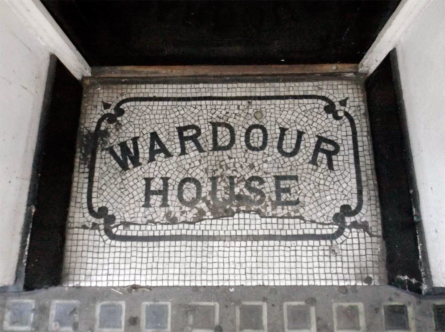
Back on Wardour Street I spied this floor mosaic outside the entrance to Wardour House, a residential building that, unlike most of Soho, doesn't seem to have had much of an eventful past. Despite this, I like to imagine this doorway has seen its fair share of illicit nocturnal activity over the years.
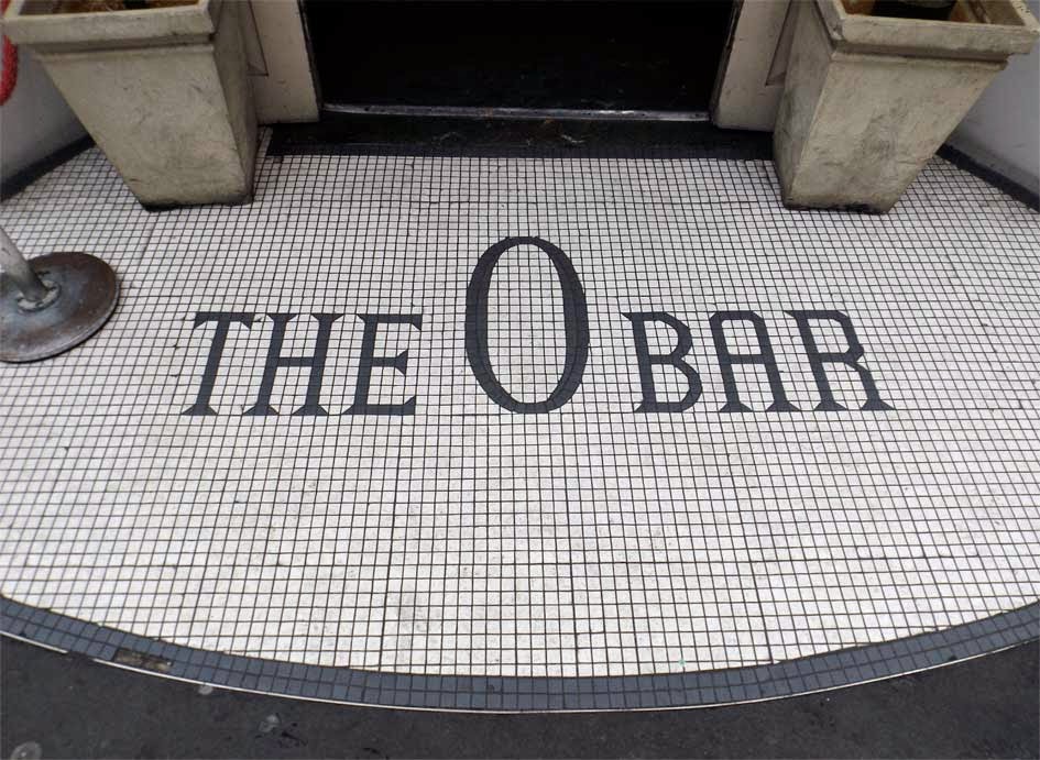
The mosaic type features sharp serifs (similar to The O Bar in part one) and a skillfully composed decorative frame that looks fairly simple but clearly took some serious skill to get right. The arched type is a pleasing touch too, giving the whole thing an appropriately homely feel.
Possibly due to the aforementioned beer, I don't seem to have a record of where I spotted this floor mosiac. From what I can see it reads 'A.VINCE' or 'AVINCE' but annoyingly I've not been able to find out anything about it. I do love a good mystery though so I'll keep my detective hat on and see what I can turn up on the coming weeks. Watch this space!
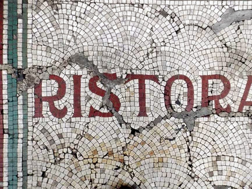
Heading up Frith Street, this impressive mosaic marks the former location of Ristorante Isola Bella, one of Soho's original Italian restaurants. The site is now home to a GBK, who had the good sense to leave the mosaic in place. Although it looks as though it has seen better days the type is still largely intact, featuring flared serifs and a curvy leg on the capital R that will warm the heart of type obsessives everywhere. Also of note is the way the mosaic has been constructed, using a method where the white tiles are set in semicircular arcs that bleed into the letters. I'm not sure if this is practical or decorative but if any mosaic makers are reading this I'd love to find out!
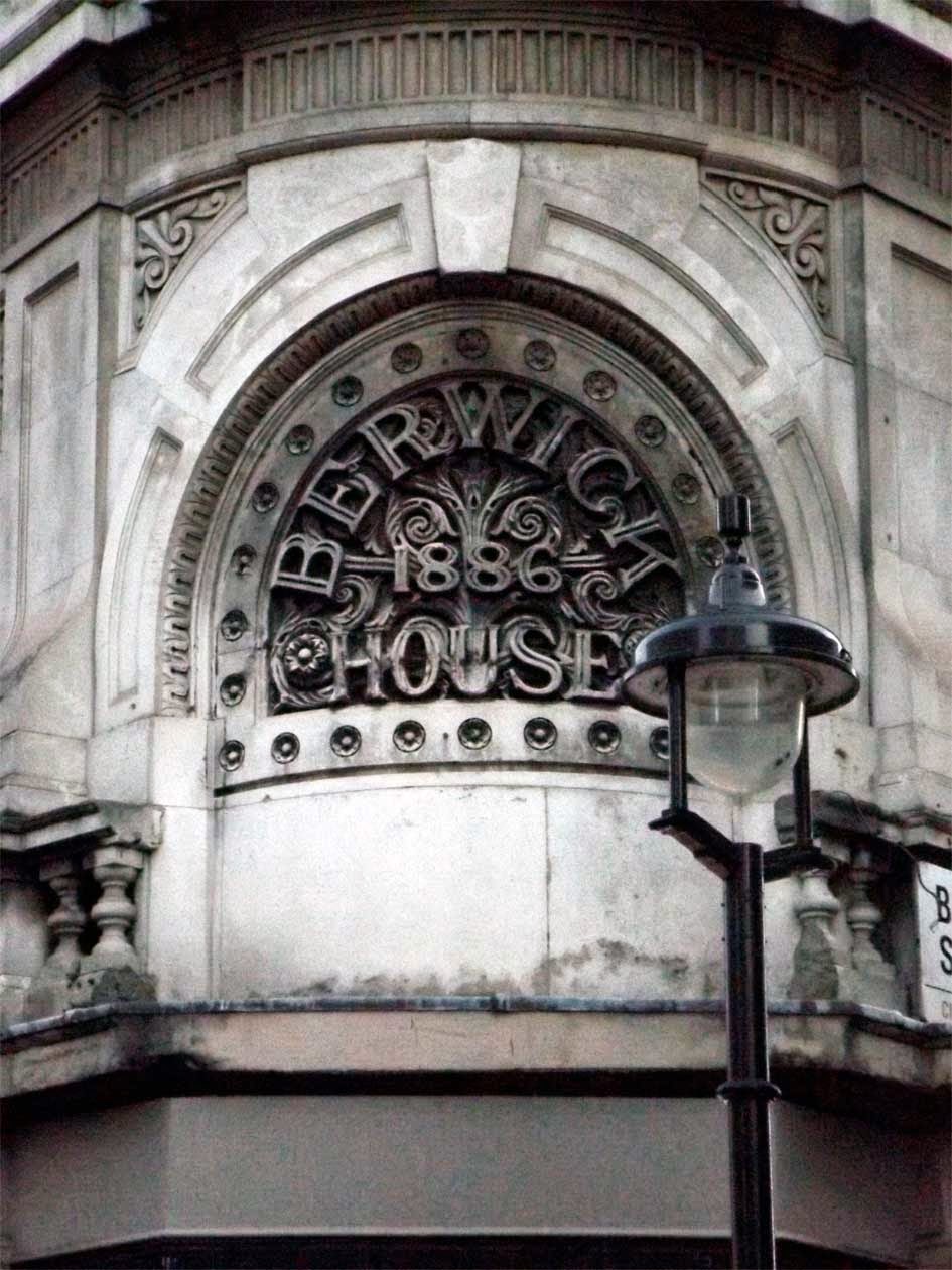
As the day wore on and the light started to fade (4pm, damn you January!) we headed back towards Oxford Street. The shopping crowds were thinning out so I took advantage of the space to grab the final picture of the day. I'd spotted this stunning bit of type high up on the corner of Berwick Street before, but I'd never had a good enough camera to reach it. This time I was better prepared.
This piece has got so much going for it, the lock up itself, the arched type, the decorative flourishes and the inner shadow on the characters all add up to a jawdroppingly impressive display of craftmanship. It makes me wonder why more people don't look up to admire these things, but then I remember that it's in the middle the busiest shopping street in the country and it all starts to make sense.
And so our day in Soho came to a close. As you might expect from an area with a long and storied past, we only managed to scratch the surface of what it contains. Fortunately, this means there's plenty of material left for a return trip, so at least I've got an excuse next time I fancy a few beers and a raid on the jukebox in the Crobar.
Thanks for reading and see you next time!


