Pages

Showing posts with label london. Show all posts

Wednesday, 21 October 2015

Sign Hunting in Stoke Newington part 2

Welcome to part two of my wanderings around Stoke Newington. During part one, I headed up and down the high street in search of interesting typography and wasn't disappointed. After a quick trip to the pub, I set out for Church Street, a road renowned as the epicentre of ghost sign activity in Stokey.

hurstleighs bakery brown bread ghost sign stoke newington

It wasn't long before I spotted my first sign on the corner of Fleetwood Street. Revealed during the removal of a billboard, the full text once read 'Hurstleigh's Bakery, Daren, Brown Bread. According to Spitalfields Life, Daren was the name of a flour mill based on the banks of the river Darent in Kent. 

What little is visible of the type looks impressive, all slab serifs and chunky drop shadows - a real sign writers dream. It's a shame there doesn't seem to be a record of the whole thing!

ghost sign lancell street stoke newington

Over the road on the corner of Lancell Street I spied a long, thin ghost sign on a chamfered corner wall. Though almost unreadable, it didn't stop me staring for five minutes trying to decipher it. The only words I can guess are 'Agents for' about half way down but sadly the rest remains a mystery.

westminster gazette gillette criterion matches ghost sign stoke newington

Heading further up Church street, I stumbled across what are possibly the most famous set of ghost signs in London. The first was this striking palimpsest advertising no less than three products: Gillette Razors, the Westminster Gazette and Criterion Matches.

Along with Hovis (they of bread fame) Gillette were one of the first brands to fully realise the potential of painted adverts as a promotional medium and as such many examples of their signs can be found around London, painted in characteristic white and yellow on a bright blue background. At some point, the other two companies must have bought the rights to use the space and painted over the older signs. Time though, the great leveller, has seen fit to even them all out and the result is a spectacular collection of lettering styles, each marking different layers of history. Fantastic!

walkers bros fountain pen repairs ghost sign stoke newington

On the front of the same building I came across what is quite possibly London's most famous (and certainly one of its most charming) ghost signs. This is the sign that originally inspired the founder of GhostSigns, Sam Roberts, to start documenting these old adverts all the way back in 2006.

Roberts is a bit of a legendary figure among ghost sign enthusiasts, being one of the first people of the Internet age to start documenting London's ghost signs. Since then he has been involved in huge amounts of sign conservation work, written books on the subject and regularly gives guided ghost sign tours around London. All in all, an inspiring character and long may his good work continue. Be sure to check out his website at ghostsigns.co.uk

walkers bros fountain pen repairs ghost sign stoke newington

Anyway, back to the sign itself. The former occupants of the building appear to have been a company called Walker Bros, who specialised in the repair of fountain pens, particularly those of Watermans, a company who are still in the pen-making business today. In today's technological world it's difficult to imagine a time when you'd actually take your fountain pen to a shop to be repaired but evidently many people did.

The sign has got huge amounts of character, being painted in a shape that aims to make the best use of the available space. The long thin panel looks to have been repainted at some point, as behind the slightly crude looking 'Fount Pens Repaired' lettering it is possible to make out hints of some chunky, serifed lettering that has more in common with the rest of the sign.

The Watermans panel features a lovely lock up of title case lettering, in what looks like a flared serif style with a heavy drop shadow. The arched Watermans type is a nice touch too. Above this, the Walker Bros panel is inset on a beautifully drawn piece of notepaper with a fountain pen laid across for good measure. What more you you ask for?

crane house decorator ghost sign stoke newington

Further up Church Street a blink-and-you'll-miss-it ghost sign clings on above Hazel Alterations on Marton Road. Though heavily faded and encircled by graffiti, it clearly advertises the services of Crane House Decorator in solid grotesque lettering.

rignold mansions stained glass fanlight stoke newington

After being spoiled by all the ghost signs I almost missed this nearby stained glass fanlight above the entrance to Rignold Mansions. It's always nice to see lettering incorporated into stained glass, especially when it takes on a stencil effect like it has here. Could this be the work of our old friends Cakebread, Robey & Co, Stoke Newington's favourite local stained glass suppliers? I'd like to think so.

the clarence tavern pub daniel defoe stoke newington

Walking back down Church Street I managed to resist the temptations of the Daniel Defoe pub, but couldn't resist snapping its former name, The Clarence Tavern, carved into the top of the building in an engraver's Gothic style of lettering.

According to History of Stokey, the Clarence Tavern was built in 1860 and is the oldest pub building on Church Street. Over the years it has undergone numerous name changes including The Salmon and Trout and Steptoes. It was finally renamed the Daniel Defoe in 1999, in honour of the author who once lived nearby.

A Rubenstein alf the purse king ghost sign stoke newington

Further on I spotted another sign that had eluded me on the way up, this time belonging to A Rubenstein & Sons, aka 'Alf the Purse King', a purveyor of purses, pouches, handbags and wallets. By all accounts a charismatic fellow, Alf can be seen in his prime here courtesy of History of Stokey.

Painted in a combination of black, white and red, this sign would have been quite striking its day. Unfortunately you have to look closely to read the type now, but what can be seen looks to be a mixture of condensed and regular sans serif lettering styles. Alf the Purse King may be long gone but his spirit certainly lives on in Church Street.

weavers arms pub ghost sign stoke newington

Back in the direction of the station, on the corner of Cazenove Road a large furniture store occupies what was once a pub known as the Weavers Arms. The only clue to the pubs existence is some rather neglected lettering carved into the top of the facade of the building's side. I've not been able to find out too much about the Weavers, other than that it looks to have been opened sometime in the mid-19th century. Some rather fantastic views of the pub in it's glory days can be seen here and here, again courtesy of History of Stokey.

madame lille corsetiere shop ghost sign stoke newington

On the opposite side of Cazenove Road a fading shopfront caught my eye. Madame Lillie's was a once a corsetiere's shop, though very little information about it can be found online. The building was most recently home to an art gallery, though at the time of my visit it looked to be empty once again.

The faded sans serif lettering of the sign is in an advanced state of disrepair, though deep drop shadows are still visible on the individual characters.

john brown whiskies ghost sign stoke newington

Looking back down Cazenove road presented yet another ghost sign (see what I mean about Stoke Newington?) Bearing the just about readable legend 'Good judges drink John Brown Whiskies', the advert has suffered plenty of fading but hints of blue, white and red can still be made out. The lettering has been painted in a mixture of flowing script (think the old Wall's ice cream logo) and a blocky grotesque style. The only thing missing is a nice hand painted whisky bottle!

As an interesting footnote, this sign was recently under threat from the owner of the building but thankfully our old friend Sam Roberts stepped in to save the day. Read all about his adventure here!


Just when I thought Cazenove Road had given up all of its secrets I found one more sign hiding in a shady corner. Although difficult to make out in the above image, the sign reads 'F.Cooper, Job Master for Wedding Carriages, Broughams, Landaus, Cabs'.

The lettering looks to have been painted in a fairly standard grotesque style, however the use of key lines holding the word 'and' as well as arched and angled text forms a varied and eye catching layout.


Last but not least, I headed off Cazenove Road in the direction of the station. Although it had already been a more fruitful day than I could have imagined, Stokey provided one last ghost sign to add to my list. Despite only a strip remaining, it is possible to make out the words '6 tables' and 'embossers', as well as some hints of an older sign that has been painted over.  Not the most spectacular sign of the day, but definitely one worth documenting.

So with that I jumped back on the Overground and headed home. As I've hopefully shown from these photos, Stoke Newington is one of the best places you can go if you're looking for ghost signs. Moreover, as an authentic taste of the old East End, it really does take some beating.

See you next time Stokey!

Wednesday, 23 September 2015

Sign Hunting in Stoke Newington part 1

Stoke Newington or 'Stokey' to the locals is a district in the London Borough of Hackney. The area has been settled since medieval times, when it was a small village a few miles from London used mainly as a stop for travellers heading north. Nowadays it is well and truly a part of the city, though it is renowned for retaining some of its village character with a large array of open spaces and a bustling town centre.

Over the last century Stokey has seen its fair share of action, from being heavily bombed during World War Two through to significant urban regeneration in the last twenty years. Nowadays it plays home to a diverse and vibrant community as well as some of the most famous ghost signs in London. With the latter in mind, I headed over on a grey Saturday morning with my camera at the ready.

elloma preparations ghost sign stoke newington london

After arriving at Stoke Newington overground station I headed left and up the high street. It wasn't long before the first find of the day presented itself, a peeling ghost sign tucked away on the side of a light industrial building. As the sign says, this was the former home of Elloma Preparations Limited, who according to Companies House were a firm active from 1947 until 1996. Exactly what they were preparing remains a mystery. 

elloma preparations ghost sign stoke newington london

Due to its length it was difficult to fit the sign into one shot, at least for an amateur like me. From what i've managed to capture the lettering looks to have been painted in a bold grotesque typeface, though most of the details have suffered significant fading over the years.

John Hawkin cotton spinners lancashire ghost sign stoke newington london

Continuing up the high street it quickly became apparent why the area is so renowned by ghost sign hunters with the appearance of a lovely example for John Hawkin & Sons, a Lancashire cotton spinning firm. The company had quite a few locations in London and if you want to know more about them, I highly recommend the London Road Croydon blog's excellent article here.

The type is a mixture of a playful, upright script with a very lovely ampersand and some clean sans-serif faces for good measure. Most of it is still readable and you can just make out the remnants of an earlier sign coming through here and there.

cakebread robey ghost sign stoke newington london

On the other side of the street, a building on the corner of Tyssen Road features an enormous sign belonging to the firm of Cakebread Robey & Co, providers of a rather extensive range of hardware services.  Famed for their stained glass in particular, numerous examples of the company's work can reportedly still be found in pubs and churches around the South East.

A striking combination of white and red, the sign itself is an example of a palimpsest, a term which in this case means a sign painted on top of an older one. The lettering isn't especially decorative but the overall layout and the use of different sized panels gives it plenty of character. Anyway, who needs fancy serifs and swashes when you've got a massive bleedin' wall?


wholesalers clock stoke newington london

Further up the high street this rather striking blue clock hangs on above the pavement, a remnant from a time when advertising your business with a giant public timepiece was the done thing. Sadly, the name of the firm responsible has disappeared, leaving us with only the word 'wholesalers' and a clock face frozen at twenty-five past five.

The lettering is a light condensed sans serif with a touch of art deco style, arranged on a curve. If you half close your eyes, the whole thing looks a bit like a cyclops sporting a big toothy grin. Or maybe it's just past my bedtime.

vogue cinema ghost sign stoke newington london

Next up is the former home of the Vogue cinema, which still retains its original 1940's signage on a chamfered wall. According to Cinema Treasures excellent article, the venue opened as the Majestic in 1920 before being renamed Vogue in the forties. In 1958 it was closed, and lay derelict for 42 years before being refurbished as a restaurant and flats at the turn of the millennium. During this period of disuse it was thought to be the longest closed cinema building in London. I can only imagine how exciting it would have been to get inside and photograph it during this time.

The lettering is in a stylish sans serif that is similar to Futura, judging by the very specific G. However, the lower crossbar on the E suggest that it may have had some customisation. Either way it's a great piece of history and kudos is due to the owner for preserving it.

no cycling painted sign stoke newington london

After crossing the road and starting to head back this charming hand-painted sign caught my eye. The delicate italic lettering features high contrast thicks and thins as well as flowing, soft serifs that enhance the polite authority of the message. If I'd had my bike with me, I would have been walking by now.

coronation avenue stoke newington london

On nearby Victorian Road I came upon the grand gateway to Coronation Avenue, crowned with some fantastic ornamental lettering. Featuring a flamboyant kick descending from the uppercase A and extended serifs on the N's, this is a typically Victorian style and one that I never tire of.

Although a peaceful looking gated community today, Coronation Avenue has known its share of tragedy, being directly hit by a bomb in World War Two that killed as many as 170 people. A harrowing first hand account of that fateful night can be found here, and serves as a stark reminder of dark times in the not too distant past.

richardson and sons shirtmakers hackney ghost sign stoke newington london

Continuing back down the high street, I spied this almost unreadable ghost sign high on the side of a building. Painted in a purpose built decorative panel, there's not much that can be said about the type but according to the Spitalfields Life's excellent article, it is an advert for Richardson & Sons Shirtmakers of Hackney, Leyton and Walthamstow, painted around 1955.

rochester castle pub mosaic stoke newington london

Nearby, the Rochester Castle pub provided the first mosaic of the day. The colour scheme of brown and gold is a good match for the fittings of the pub and the lightly serifed type has some great decorative touches including a double crossbar on the A and extended tails on the R's.

According to owners J D Wetherspoon, the pub itself was built in 1801 by Richard Payne, who was originally from Rochester. Prior to that, the site was home to another inn called the Green Dragon which had occupied the space since at least 1702. The Rochester is also noteworthy for being the longest held premises in the company's portfolio, being purchased by the chain as far back as 1983.

marks and spencer ghost sign stoke newington london

Across the road, a Georgian style building set back from the street features a very faint ghost sign for the original owners: none other than Marks & Spencer, the famous department store. Now home to a branch of Sports Direct, the fortunes of this building seem to have declined slightly since its construction in the 1930's, however its well preserved exterior lends a touch of faded glamour to the street.

the three crowns pub sign stoke newington london

As it was getting on for lunchtime the Three Crowns pub was next to catch my eye with its beautifully elaborate side entrance, painted in an regal combination of blue and gold. The decorative carving features the pub name written in some tightly spaced lettering that's not too flashy, but boasts elegant flared serifs and a satisfying curved crossbar on the N.

the three crowns pub saloon lounge sign stoke newington london

The side entrance is also home to some fantastic ironwork featuring the words 'Saloon Lounge' picked out in a neat gold script. I love the way the type and ornaments intertwine here and the angled lines are a great touch. The only thing that lets it down is the dodgy kerning between the L and the O that you could drive a truck through. My inner designer screams in terror, while the realist in me reckons that I ought to get out more.

At this point I nipped through this wonderful doorway and into the pub, so it seems like a good place to finish part one. If you made it this far, thanks for reading and look out for part two coming next week. Cheers!

Wednesday, 25 February 2015

City of Contrasts: Exploring East London

One cold Saturday morning the better half and I nipped into London hoping for a walk along the Thames foreshore. Unfortunately, we completely forgot to check the tides (if only I'd got up for the shipping forecast) so we ended up heading to St Paul's instead.

saint pauls old choir school building london

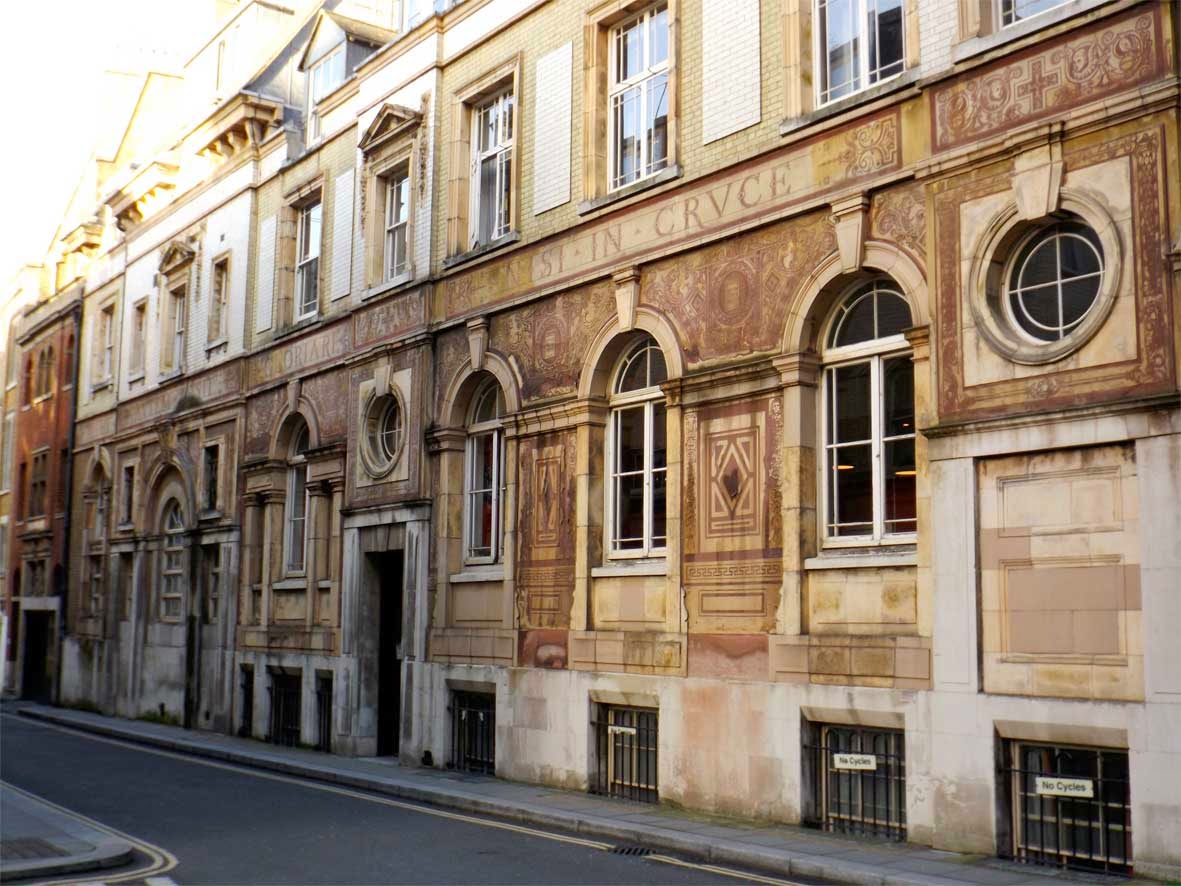
After developing a cold sweat in the presence of the cathedral entrance fee we settled for admiring the view from the outside. While on the steps I caught a glimpse of an unusual building down Dean's Court. What we found is one of London's real hidden gems: the St Paul's Old Choir School building. Featuring elaborate sgraffito carving all over the outside, this curious place looks as though it was teleported straight from the streets of Prague.

saint pauls old choir school building london close up

Looking closely at the type running around the building reveals the huge amount of effort that has gone into each character. Lots of little details like fills, key lines and ornaments are all seemingly designed to show off the skill of the carver.

saint pauls old choir school building london close up

This close up shows the level of detail in the pictorial carvings. The book with VETVS TESTA MENTV is a particularly nice touch with it's detailed frame and angelic guardian.

snashall and son ghost sign kings wardrobe london

After navigating a quaint network of narrow streets we came upon a quiet courtyard called Wardrobe Place. This was once the site of the King's Wardrobe, a storehouse used by King Edward III to house state robes removed from the Tower of London. Destroyed in the great fire of 1666, the wardrobe lives on through a blue plaque within the square.

Wardrobe Place is definitely one of the most charming areas of London I've come across. In many ways it feels like a step back in time, all eerily quiet with few signs of the bustling city penetrating the stillness. It's also rumoured to be haunted; according to London Constant a ghostly lady in white has been regularly sighted running from door to door.

Luckily for her she's not alone. Wardrobe place also contains another ghost (albeit in sign form) for Snashall & Son, Printers, Stationers and Account Book Manufacturers (see above). Although worn the sign is still readable and features some of the finest painted script I've seen. Sadly, there's a lack of available information on the company but we can safely assume that they haven't been manufacturing account books in Wardrobe Place for some time.


Leaving Wardrobe place this monogram nestled in an arched doorway caught my eye. I can just about make out an S, B and perhaps an ampersand but otherwise it's hard to decipher and unfortunately the building offered no clues either. Looks like this is another addition to my ever growing list of mysteries!

garlick hill street sign london

Next we headed back out onto Queen Victoria Street in the direction of Bank. On the way we passed this fading street sign high on the side of a building. According to The Street Names blog, Garlick hill was named after a nearby wharf where shipments of garlic were once landed. Although London has thousands of these old painted street signs this one has a particular charm, its italicised type and small E.C marker giving it a oddly polite tone of voice.

church court st margarets close sign london

Speaking of street names, nearby St Margaret's Close is evidently a rather new addition to the map. I'm not sure when the change from Church Court took place however the original sign has been left meaning this great contrast of old and new London can still be enjoyed. 

Although there's nothing distinct about the typography Church Court has a beautiful weather worn feel, especially when compared to clean, shiny Albertus of today's sign.

While we're on the subject, for more information on the thousands of alleyways and passages around London I'd recommend Ivor Hoole's extensive guide here. Although dormant since 2004, Ivor has at some point visited over 400 sites around central London and dug up an impressive amount of information on each. This is definitely one of the best resources you could hope to find!

7 lothbury street sign

Continuing east we passed along Lothbury, a small street running behind the Bank of England. Once home to candlestick makers and copper smiths, today the street is part of London's bustling financial district.

This medieval looking piece of type marking No.7 Lothbury has some great quirks: the L's extended decorative tail, the lowercase h and the U that looks more like a V. The R and the Y feel like a bit of an afterthought, squeezed in together at the end which gives the whole piece some pleasing hand carved character.

carved 4 lothbury london

Continuing down Lothbury I couldn't pass this beautiful stone carved No.4 without taking a picture. The lines are dead straight with beautifully sharp serifs and a bright gold inlay. It's hard to believe that this could have been done by hand.

drapers hall sign london

Next stop was Drapers Hall, home to the Drapers Company, one of the historic London Livery Companies that have represented the major trades of the city since 1515. Drapers Hall has been present at this site since 1543, despite being burnt to the ground on more than one occasion.

This sign near the entrance to the Hall has some unusual typographic features including a high crossbar on the uppercase H and an L that gets around the issue of kerning by dropping below it's partner. The impression overall is of an elegant, condensed serif with a hint of decorative style.

throgmorton restaurant entrance london

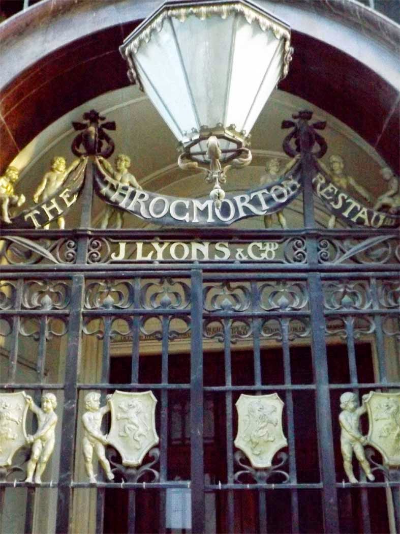
Not too far on, this grand entrance marks the former home of the Throgmorton Restaurant. For many years owned by tea merchants J Lyons & Co, the restaurant was in continuous use between 1900 and 2013 and was very popular amongst financial workers, who favoured its grand interior as a place to wine and dine clients. An brief history of the restaurant can be found here.

The restaurants iron gate with its elaborate mix of patterns, figures, heraldry and banners also features some noteworthy type. The word 'Throgmorton' has some impressive long tailed R's while 'Restaurant' looks as though the designers ran out of room and crammed the smaller characters in at the end. My personal favourite part is the lock up of '& Co Ltd' which stands out as great example of typographic layout.

railway tavern pub london

Heading towards Liverpool Street station the sight of the Railway Tavern seemed to pull me in like a tractor beam. After all, it was getting on for lunchtime.

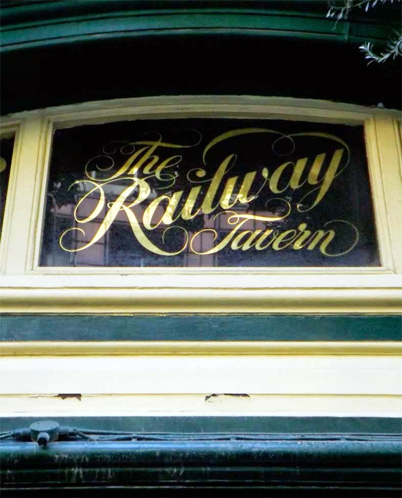
According to Pub History the Railway has existed on this site in one form or another since 1736. Situated conveniently close to one of London's largest stations, there's no doubt that it has been the cause of many missed trains over the years. Apart from the liquid offerings inside my favourite aspect of the pub has to be this painted window above the side entrance.

Featuring some flowery script and a nice big drop cap R this window is full of character. Details like the extended bar of the T in 'The' and the lowercase L in 'Railway' give the type plenty of flow while the swash coming from the tail of the Y leads your eye around and down to 'Tavern'. Very clever indeed.

welz pork butcher ghost sign bethnal green london

At this point there's a bit of a hole in my series of photos (damn you, Railway Tavern!). So, we'll pick up the pace a few hours later, halfway down Bethnal Green road.

This old sign for C. Welz Pork Butcher has certainly seen better days but is still hanging in there. An archive issue of The London Gazette reveals that Christian Welz, Bethnal Green pork butcher applied to change his surname to Wells 9th of July 1915, which enables us to date the sign to some time before that. Looking closely it seems as though the name was also changed to V.A. Welz at one time though most of this seems to have crumbled away now.

The sign itself is great, with no nonsense bold red type that would have been quite visible on the whitewashed wall at one time. The Welz (or Wells) family may be long gone but their legacy will hopefully live on here for some time to come.

owen and thomas ghost sign bethnal green london

Walking slightly further down the road revealed ghost sign number two, this time for Owen & Thomas, a firm of Linen Drapers listed in the 1921 Street Directory.

Painted in a simple style commonly seen around London, the sign features black lettering on a white background with a heavy black border. The type is a no-frills sans serif with only the small ampersand providing a hint of decoration. As can be seen in the picture the site is now home to a bank, however the height of the sign has allowed it to escape being covered up. Good thing too!

zamo cleaning products sign hackney wick london

After jumping on the Central Line at Bethnal Green, we headed via Stratford to Hackney Wick. Alighting the Overground the one thing that struck me was the graffiti - it's absolutely everywhere with some pieces covering whole sides of buildings. Despite being on the fringes of trendy East London the Wick keeps strong links to its industrial past through the survival of its factory and warehouse buildings, many of which are still working today.

One of these warehouses belongs to Zamo, a manufacturer of cleaning products. Aside from the aforementioned graffiti Zamo's building features an eye catching hand painted sign with a bright orange, 3D slab serif logo which almost feels like a piece of graffiti itself. We're a long way from the elegant serifs of Throgmorton Street now.

achilles serre ghost sign hackney wick london

Walking down the intriguingly named White Post Lane this well known ghost sign marks the former home of Achilles Serre, the company famous for introducing dry cleaning to the UK. According to Roy Brazier's book The Achilles Serre Story, In 1870 Mr Serre moved over from France to start the business, and sometime in the early 20th century the company moved to Hackney Wick. The company thrived through the first half of the century, at one point owning over 400 high street stores in England alone. Sadly, they fell into decline during the 1960's and now this sign is the last reminder of their once considerable presence in Hackney Wick.

achilles serre ghost sign hackney wick london

The sign itself looks as though it was originally made up of black type on a white background, though it appears to have been significantly weathered over time. The lock up of the type is quite unique, with huge drop cap A and S characters positioned to make best use of the layout of the building. The font appears to be an Art Nouveau style, and bears many similarities to the more modern typeface ITC Benguiat.

h scully ghost sign hackney wick london

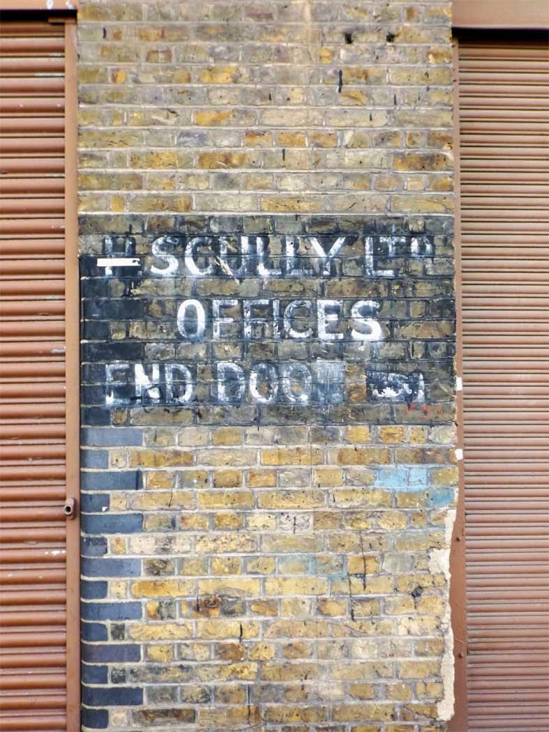
While making a beeline to the Crate Brewery in Queen's Yard (it was the tractor beam again) I spied a small ghost sign next to some warehouse doors. Despite my best efforts I've been unable to trace the buildings original occupants, H Scully Ltd, beyond that they were still trading here as recently as the 1960's. There's a great image of their warehouses taken in 1971 on David Christies Flickr page, featuring some considerably larger painted signs. Check it out here.

Although it provides an intriguing hint into the area's past, the sign's typography is fairly standard. However, it does have the distinction of being the first I've found to feature a manicule (pointing hand symbol, bottom right corner) though this is heavily faded now. A nice touch of detail nevertheless!

the cut painting hackney wick london

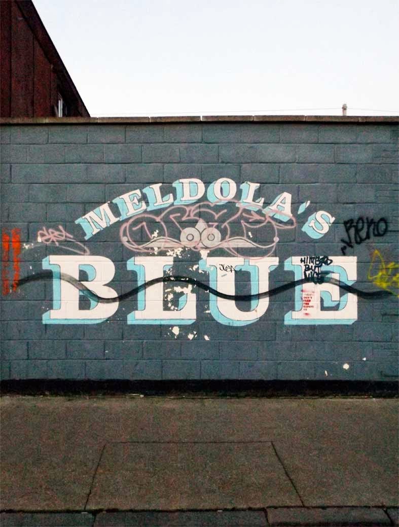
meldolas blue painting hackney wick london

On the way back to the station after an hour or two in the brewery bar we walked by this fantastic pair of modern murals painted by Bread Collective as part of their 'The Walls Have Ears' project - a celebration of important aspects of the Wick's history.

The Cut refers to the Hackney section of the Lee Navigation canal, known locally as the Hackney Cut, while Meldola's Blue is the name of a famous dye invented here by Raphael Meldola in the late 19th century. Used as a pigment for paints, papers and textiles, Meldola's Blue was a highly significant discovery and is still widely used today.

It's great to see an art project that aims to educate people about local history in a contemporary way. It's a shame that these murals have been marked by graffiti, but as the final picture of the day proves, it really is difficult to avoid this in Hackney Wick.

the lord napier pub hackney wick london

The Lord Napier is a former pub next to the Overground station that according to Closed Pubs can be traced back to at least 1874. Over the years it was owned by Ind Coope and Taylor Walker before becoming a freehouse in 1991 and closing for good in 1995.

Although it has remained largely empty ever since the Napier has become a bit of a landmark in the local area with it's ever changing roof to pavement covering of impressive street art. Occasionally home to squatters, raves and pop up exhibitions, the Napier isn't completely dead but it seems a real shame that there hasn't been an attempt to revive it in recent years.

The pubs wooden signage can still be seen behind the layers of paint but really this place is all about the manic paintings. Although it has stopped dispensing pints, The Lord Napier instead provides Hackney Wick an ever evolving canvas that brings soul and colour to the neighbourhood. It also serves as a fitting end to a great day out through some of East London's most contrasting areas.

So until next time, thanks for reading!

PS: David Christie has a great Flickr gallery on the Lord Napier, be sure to check it out here.

Wednesday, 11 February 2015

Passing Through Putney

A couple of Sundays ago we took a trip to Putney hoping for some fresh air to kill off a pair of nasty hangovers. To say we suceeded was an understatement as the air was more than fresh; it was absolutely freezing and all the new Christmas scarves in the world were no match for the icy blast that came careering up the Thames.

Fortunately, I managed to keep enough feeling in my fingers to photograph some of the typographic highlights that appeared along the way.

university mansions typography putney

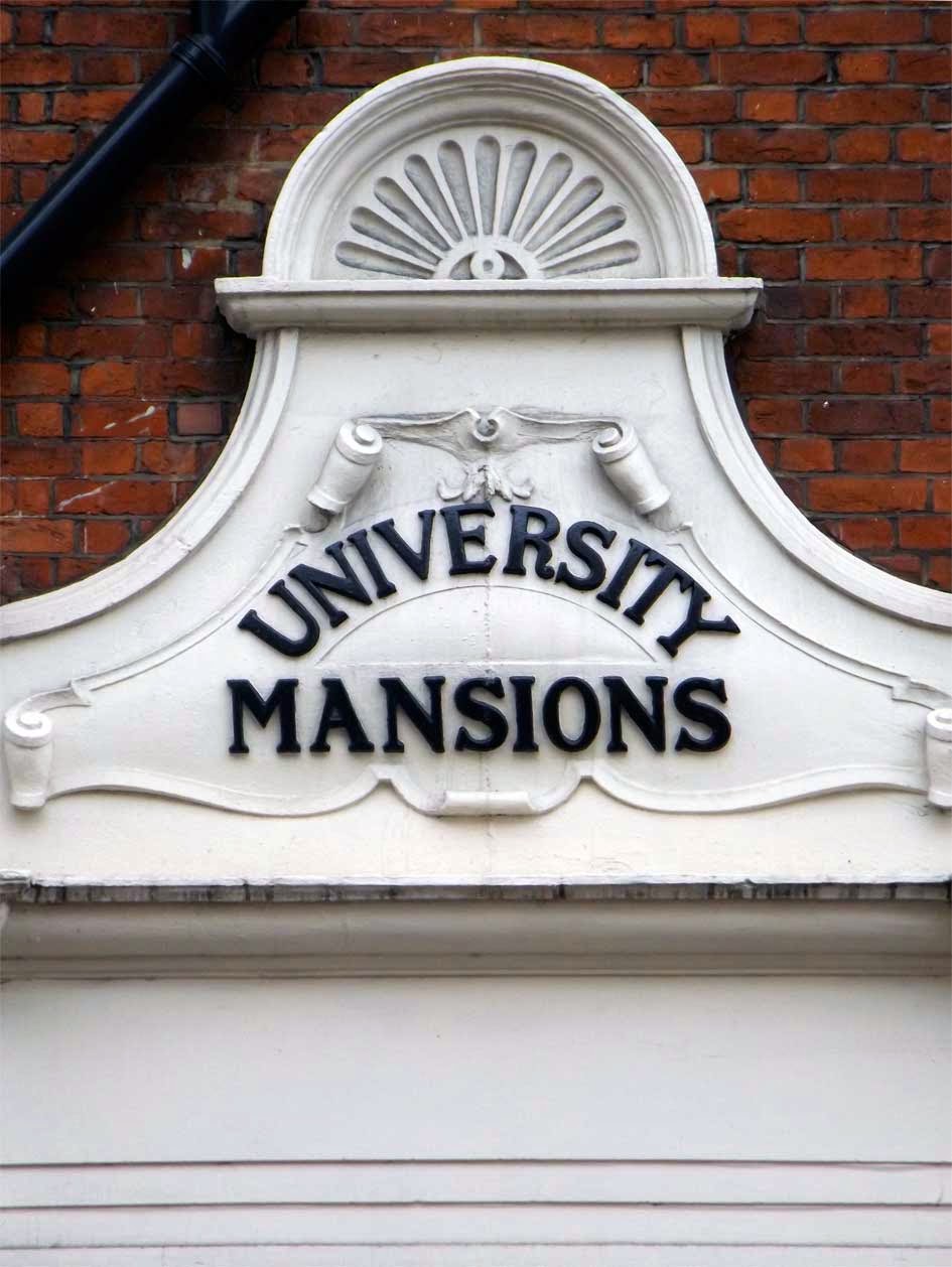
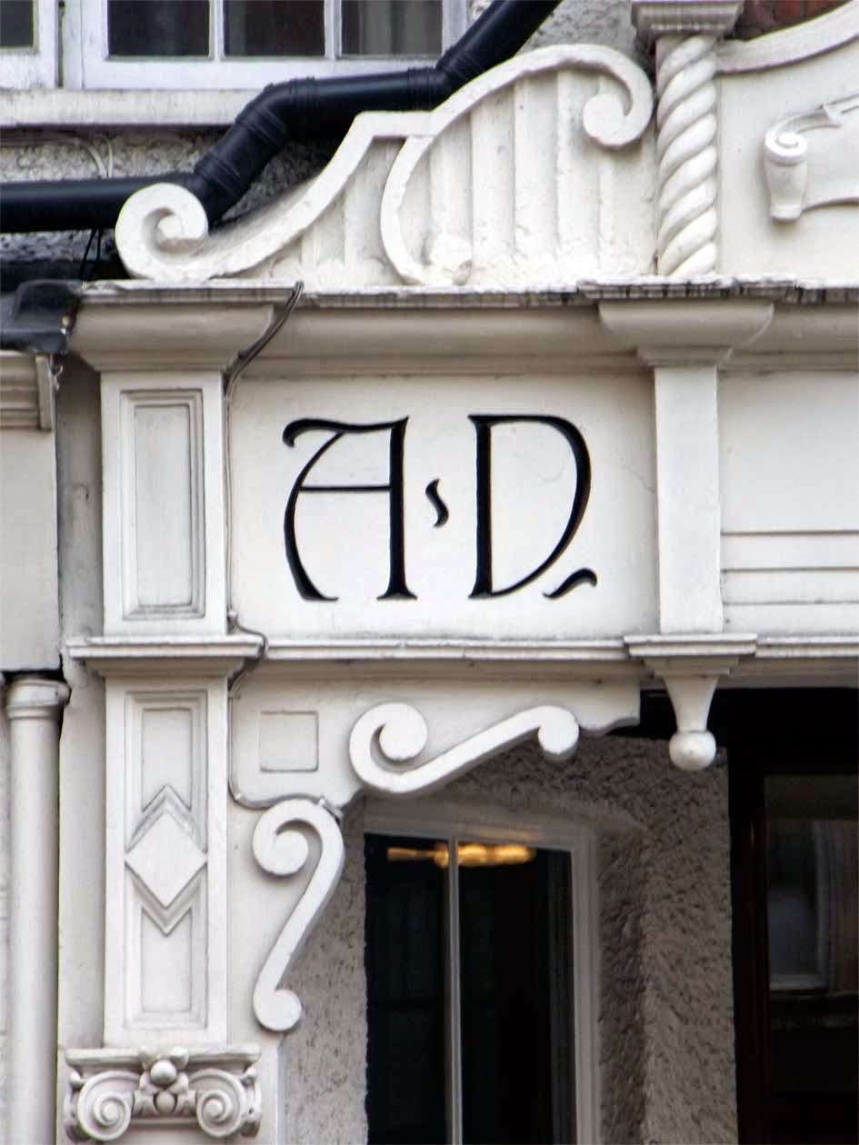
After parking by the river near the Star and Garter pub, we passed University Mansions, a large residential development with an impressive doorway featuring some great type. The raised black lettering (above) sits atop the door in a suitably grand fashion, while on either side (see below) an elegant inscription indicates the year of construction. 

university mansions typography putney

university mansions typography putney

I'm a big fan of the Art Nouveau flick on the A, and the way the date is locked up is quite bizarre. Is this ornament for ornaments sake or the carver leaving his mark? Who can say but either way it's rather eyecatching and was a good first find of the day.

university mansions typography putney

Before leaving University Mansions I have to mention the decorative typeface used on the floor of the entrance (I did say this was a good doorway) where just about every character has a satisfying quirk of some sort. Look at that N! The E! The leg of the R and the cross bar of the A! This is a beautiful display alphabet that deserves better than being walked on all day.

kenilworth court putney typography

Continuing along in the direction of the High Street another grand block of flats presented itself. According to Wikipedia, Kenilworth Court was built at the turn of the century and has had a number of notable residents over the years, including Fred Russell, the founder of modern ventriloquism.

This marker above the doorway continues the impressive raised lettering theme of University Mansions, but this time with the addition of some big drop-caps for good measure. The CO lock up on the word 'Court' is fantastic and bring bags of character, while the open O's, the flared leg of the R and the cross bar of the H add touches of Edwardian style.

kenilworth court putney typography

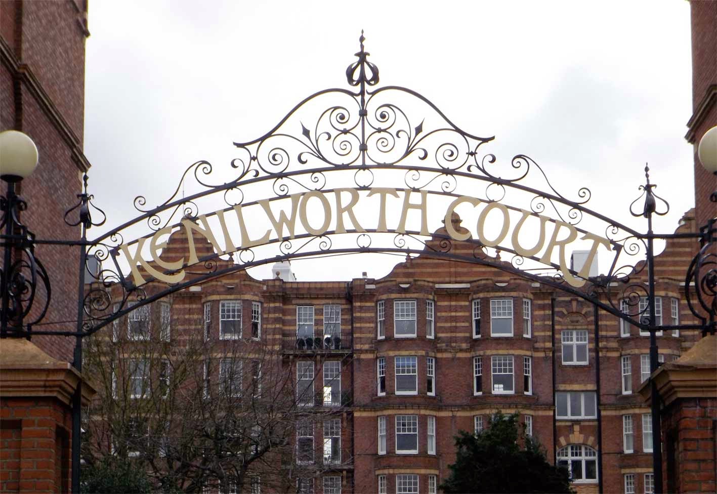
But wait, that's not all! Not to be outdone, Kenilworth Court also boasts this magnificent wrought ironwork sign above the entrance to the car park. Slightly different in style to the type above the door (the concept of branding was in its infancy in those days) this type features more R's with flared legs and a K that wants to kick the E into next week. Again, loads of character and lets face it, who wouldn't want to drive out under this every day?

guinness mosaic whistle and flute the swift putney

Walking down Putney High Street, my manic scouring of doorways, pavements and corners of buildings was eventually rewarded with this floor mosaic located in the doorway of trendy Fullers bar, The Swift. With its heavy wear and seventies colour scheme I assumed the mosaic would be quite old though according to the Camra South West London branch, the pub was converted from a bank in 1995 and named P Shannon & Sons, before becoming The Whistle & Flute in 2000 and The Swift in 2013. I'm guessing the mosaic is from the P Shannon days, making it a fairly modern example of a doorway mosaic and the first that I've seen to feature the logo of a particular brand, rather than the name of the premises itself.

salisbury pavement buildings putney

Further down the high Street, this commermorative plaque sits high on the side of the Salisbury Pavement Buildings. It's unclear why the word 'pavement' would be used but Salisbury refers to Lord Salisbury, the British Prime Minister at the time. Busts of Salisbury and Disraeli are also visible above the shopfronts. This shows how differently the political figures of the day were percieved in the late 1800's - you certainly wouldn't expect to find busts of David Cameron & Co on a building today!


putney school of art sign

After walking to the end of the high street we eventually came upon the Putney School of Art building and this impressive sign overlooking the railway. Although the school was founded in 1883, my guess is that this sign is from a much later date as there's barely a scratch on it. The lettering appears to be hand painted and is quite striking from a distance, but then you'd expect an art school sign to be wouldnt you?

putney school of art doorway type detail

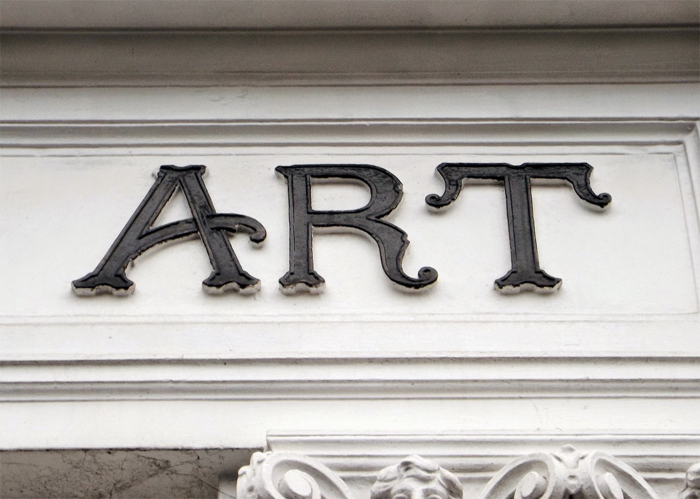
Located above the school's main doorway, this particular piece of lettering deserves a mention if only for the curved crossbar on the A.

putney school of art building date plaque

The same can also be said for this plaque near the top of the building which features some beautiful decorative figures, including a flat topped number 8 which seems to have been a popular style at the time. I always find it interesting that date plaques used to be such a common feature on all kinds of buildings, yet they are rarely seen on new architecture. Perhaps it's considered to be showing off, but it seems a shame that this tradition isn't carried on.

w h barnes piano london

After looping round and heading back towards the high street this painted piano lettering jumped out at me from a charity shop window. It appears to be an Edwardian script, with flowery capitals and cursive lowercase characters. The slight angle and bold underline give it a confident and dynamic air, while 'London' printed in a flared serif below provides grounding and balance.

The little information I've been able to uncover about WH Barnes on Piano Shop indicates that they were active in London between 1828 and 1937, and mostly produced affordable pianos that were very popular and can still be commonly found today. 

winchester house club gateway putney

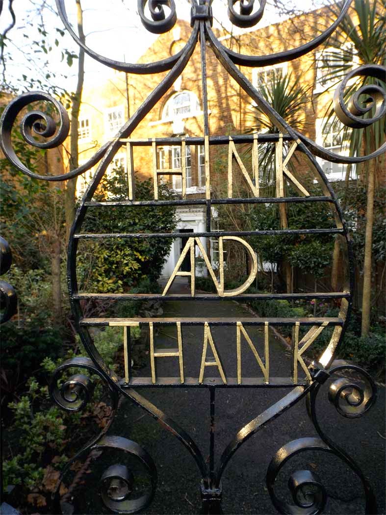
Walking back towards the river this strange ornamental iron gate grabbed my attention. The type isn't particularly stunning but the phrase "Think and Thank" is quite memorable. It transpires that this is the home of the Winchester House Club, a private gentleman's establishment and the motto gives thanks to members of the club who have served with the armed forces. According to Dale Carnegie, "Think and Thank" is a common inscription within many of England's Cromwellian churches and refers to giving thanks to God. You learn something new every day!

undertaker ghost sign clock clinic putney

undertaker ghost sign clock clinic putney

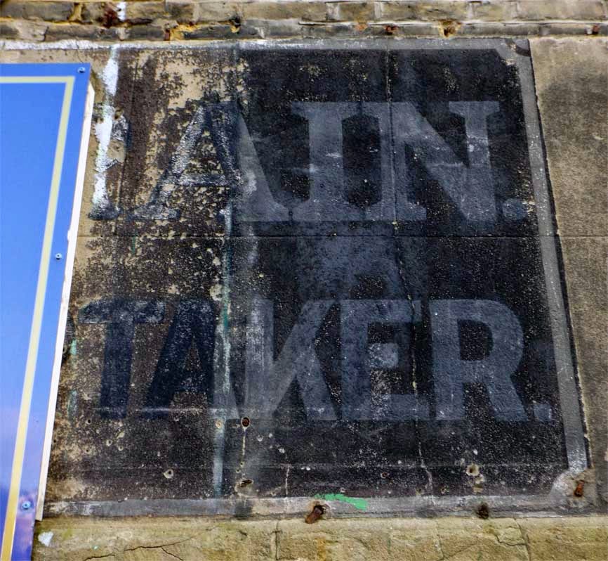
Further along Lower Richmond Road the first ghost sign of the day presented itself. Half hidden behind a metal plaque the sign appears to read "...AIN ...TAKER".
I enquired with the buildings current owners The Clock Clinic as to the past occupants. They were able to confirm that the building was an Undertaker's premises until the early seventies, and that the basement served as an air raid shelter during WW2. Unfortunately, they couldn't tell me the name of the business and a subsquent trawl of the digitised London Trade directory archives hasn't revealed anything either. Sadly it looks as though this will remain a mystery for some time to come!

putney woodwork ghost sign

Also on Lower Richmond Road, our final find was this heavily faded ghost sign on the corner with Ruvigny Gardens. Sadly, most of the type is now unreadable though I can just about make out "...and Sons, Everything Woodwork" which at least tells us a bit about the nature of the business, if not the company name. Once again I've scoured old directories for further information but have had no luck in uncovering anything. Note for next time: need to work on my research skills!

I imagine this sign would have been quite striking in its day. The bold white type and heavy black drop shadow would have provided visibility for some distance down Lower Richmond Road. It's left me quite intrigued so hopefully further investigation will turn up some more information. As always, if anyone reading this has any recollection of this or any of the other sites mentioned please do get in touch as I'd love to hear from you.

Right, that's enough fresh Putney air for one day. Bring on summer for another visit and some riverside beers. Cheers!