One cold Saturday morning the better half and I nipped into London hoping for a walk along the Thames foreshore. Unfortunately, we completely forgot to check the tides (if only I'd got up for the shipping forecast) so we ended up heading to St Paul's instead.
Continuing down Lothbury I couldn't pass this beautiful stone carved No.4 without taking a picture. The lines are dead straight with beautifully sharp serifs and a bright gold inlay. It's hard to believe that this could have been done by hand.
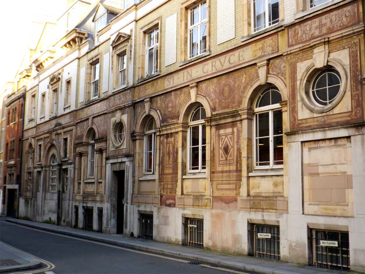
After developing a cold sweat in the presence of the cathedral entrance fee we settled for admiring the view from the outside. While on the steps I caught a glimpse of an unusual building down Dean's Court. What we found is one of London's real hidden gems: the St Paul's Old Choir School building. Featuring elaborate sgraffito carving all over the outside, this curious place looks as though it was teleported straight from the streets of Prague.
Looking closely at the type running around the building reveals the huge amount of effort that has gone into each character. Lots of little details like fills, key lines and ornaments are all seemingly designed to show off the skill of the carver.
This close up shows the level of detail in the pictorial carvings. The book with VETVS TESTA MENTV is a particularly nice touch with it's detailed frame and angelic guardian.
After navigating a quaint network of narrow streets we came upon a quiet courtyard called Wardrobe Place. This was once the site of the King's Wardrobe, a storehouse used by King Edward III to house state robes removed from the Tower of London. Destroyed in the great fire of 1666, the wardrobe lives on through a blue plaque within the square.
Wardrobe Place is definitely one of the most charming areas of London I've come across. In many ways it feels like a step back in time, all eerily quiet with few signs of the bustling city penetrating the stillness. It's also rumoured to be haunted; according to London Constant a ghostly lady in white has been regularly sighted running from door to door.
Luckily for her she's not alone. Wardrobe place also contains another ghost (albeit in sign form) for Snashall & Son, Printers, Stationers and Account Book Manufacturers (see above). Although worn the sign is still readable and features some of the finest painted script I've seen. Sadly, there's a lack of available information on the company but we can safely assume that they haven't been manufacturing account books in Wardrobe Place for some time.
Leaving Wardrobe place this monogram nestled in an arched doorway caught my eye. I can just about make out an S, B and perhaps an ampersand but otherwise it's hard to decipher and unfortunately the building offered no clues either. Looks like this is another addition to my ever growing list of mysteries!
Next we headed back out onto Queen Victoria Street in the direction of Bank. On the way we passed this fading street sign high on the side of a building. According to The Street Names blog, Garlick hill was named after a nearby wharf where shipments of garlic were once landed. Although London has thousands of these old painted street signs this one has a particular charm, its italicised type and small E.C marker giving it a oddly polite tone of voice.
Speaking of street names, nearby St Margaret's Close is evidently a rather new addition to the map. I'm not sure when the change from Church Court took place however the original sign has been left meaning this great contrast of old and new London can still be enjoyed.
Although there's nothing distinct about the typography Church Court has a beautiful weather worn feel, especially when compared to clean, shiny Albertus of today's sign.
While we're on the subject, for more information on the thousands of alleyways and passages around London I'd recommend Ivor Hoole's extensive guide here. Although dormant since 2004, Ivor has at some point visited over 400 sites around central London and dug up an impressive amount of information on each. This is definitely one of the best resources you could hope to find!
Continuing east we passed along Lothbury, a small street running behind the Bank of England. Once home to candlestick makers and copper smiths, today the street is part of London's bustling financial district.
This medieval looking piece of type marking No.7 Lothbury has some great quirks: the L's extended decorative tail, the lowercase h and the U that looks more like a V. The R and the Y feel like a bit of an afterthought, squeezed in together at the end which gives the whole piece some pleasing hand carved character.
Continuing down Lothbury I couldn't pass this beautiful stone carved No.4 without taking a picture. The lines are dead straight with beautifully sharp serifs and a bright gold inlay. It's hard to believe that this could have been done by hand.
Next stop was Drapers Hall, home to the Drapers Company, one of the historic London Livery Companies that have represented the major trades of the city since 1515. Drapers Hall has been present at this site since 1543, despite being burnt to the ground on more than one occasion.
This sign near the entrance to the Hall has some unusual typographic features including a high crossbar on the uppercase H and an L that gets around the issue of kerning by dropping below it's partner. The impression overall is of an elegant, condensed serif with a hint of decorative style.
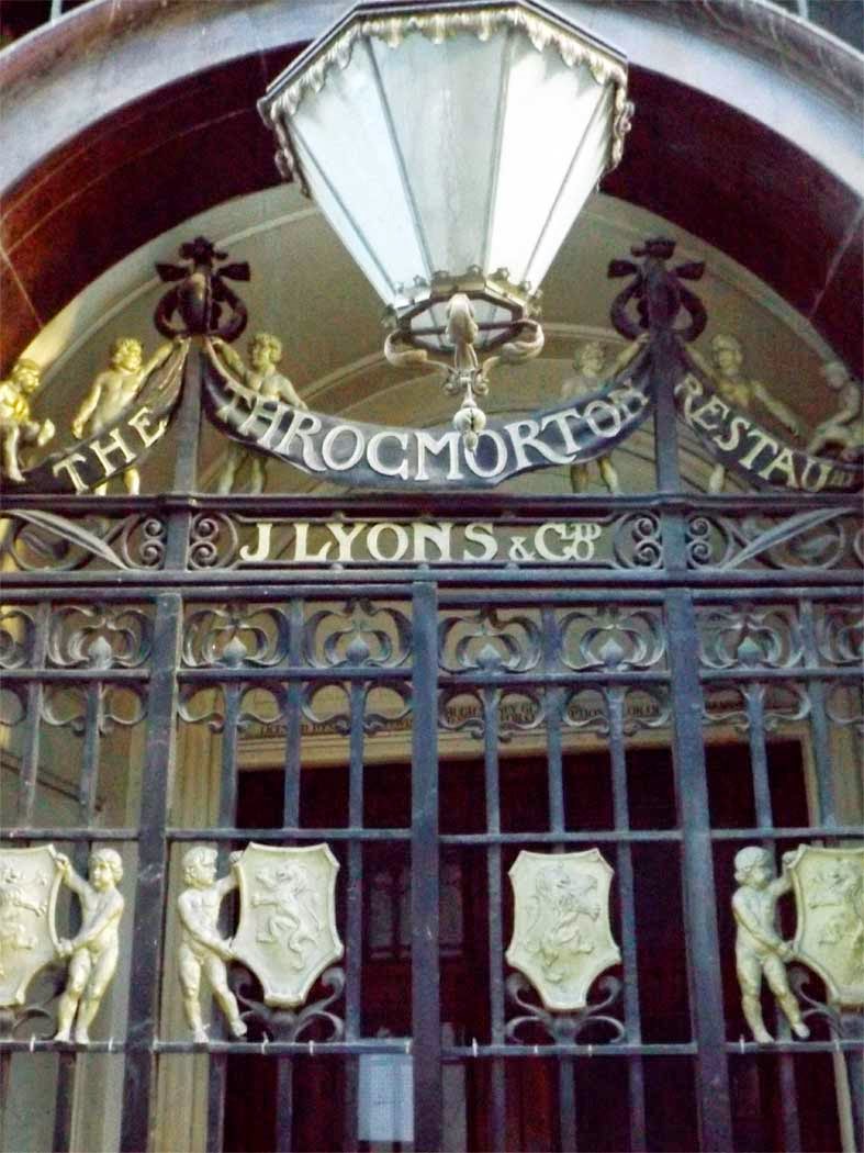
Not too far on, this grand entrance marks the former home of the Throgmorton Restaurant. For many years owned by tea merchants J Lyons & Co, the restaurant was in continuous use between 1900 and 2013 and was very popular amongst financial workers, who favoured its grand interior as a place to wine and dine clients. An brief history of the restaurant can be found here.
The restaurants iron gate with its elaborate mix of patterns, figures, heraldry and banners also features some noteworthy type. The word 'Throgmorton' has some impressive long tailed R's while 'Restaurant' looks as though the designers ran out of room and crammed the smaller characters in at the end. My personal favourite part is the lock up of '& Co Ltd' which stands out as great example of typographic layout.
Heading towards Liverpool Street station the sight of the Railway Tavern seemed to pull me in like a tractor beam. After all, it was getting on for lunchtime.
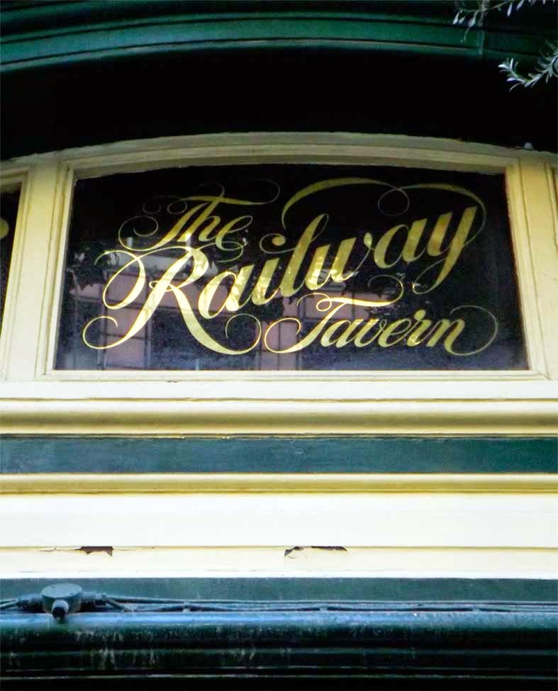
According to Pub History the Railway has existed on this site in one form or another since 1736. Situated conveniently close to one of London's largest stations, there's no doubt that it has been the cause of many missed trains over the years. Apart from the liquid offerings inside my favourite aspect of the pub has to be this painted window above the side entrance.
Featuring some flowery script and a nice big drop cap R this window is full of character. Details like the extended bar of the T in 'The' and the lowercase L in 'Railway' give the type plenty of flow while the swash coming from the tail of the Y leads your eye around and down to 'Tavern'. Very clever indeed.
At this point there's a bit of a hole in my series of photos (damn you, Railway Tavern!). So, we'll pick up the pace a few hours later, halfway down Bethnal Green road.
This old sign for C. Welz Pork Butcher has certainly seen better days but is still hanging in there. An archive issue of The London Gazette reveals that Christian Welz, Bethnal Green pork butcher applied to change his surname to Wells 9th of July 1915, which enables us to date the sign to some time before that. Looking closely it seems as though the name was also changed to V.A. Welz at one time though most of this seems to have crumbled away now.
The sign itself is great, with no nonsense bold red type that would have been quite visible on the whitewashed wall at one time. The Welz (or Wells) family may be long gone but their legacy will hopefully live on here for some time to come.
Walking slightly further down the road revealed ghost sign number two, this time for Owen & Thomas, a firm of Linen Drapers listed in the 1921 Street Directory.
Painted in a simple style commonly seen around London, the sign features black lettering on a white background with a heavy black border. The type is a no-frills sans serif with only the small ampersand providing a hint of decoration. As can be seen in the picture the site is now home to a bank, however the height of the sign has allowed it to escape being covered up. Good thing too!
After jumping on the Central Line at Bethnal Green, we headed via Stratford to Hackney Wick. Alighting the Overground the one thing that struck me was the graffiti - it's absolutely everywhere with some pieces covering whole sides of buildings. Despite being on the fringes of trendy East London the Wick keeps strong links to its industrial past through the survival of its factory and warehouse buildings, many of which are still working today.
One of these warehouses belongs to Zamo, a manufacturer of cleaning products. Aside from the aforementioned graffiti Zamo's building features an eye catching hand painted sign with a bright orange, 3D slab serif logo which almost feels like a piece of graffiti itself. We're a long way from the elegant serifs of Throgmorton Street now.
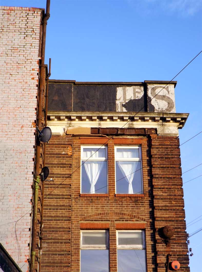
Walking down the intriguingly named White Post Lane this well known ghost sign marks the former home of Achilles Serre, the company famous for introducing dry cleaning to the UK. According to Roy Brazier's book The Achilles Serre Story, In 1870 Mr Serre moved over from France to start the business, and sometime in the early 20th century the company moved to Hackney Wick. The company thrived through the first half of the century, at one point owning over 400 high street stores in England alone. Sadly, they fell into decline during the 1960's and now this sign is the last reminder of their once considerable presence in Hackney Wick.
The sign itself looks as though it was originally made up of black type on a white background, though it appears to have been significantly weathered over time. The lock up of the type is quite unique, with huge drop cap A and S characters positioned to make best use of the layout of the building. The font appears to be an Art Nouveau style, and bears many similarities to the more modern typeface ITC Benguiat.
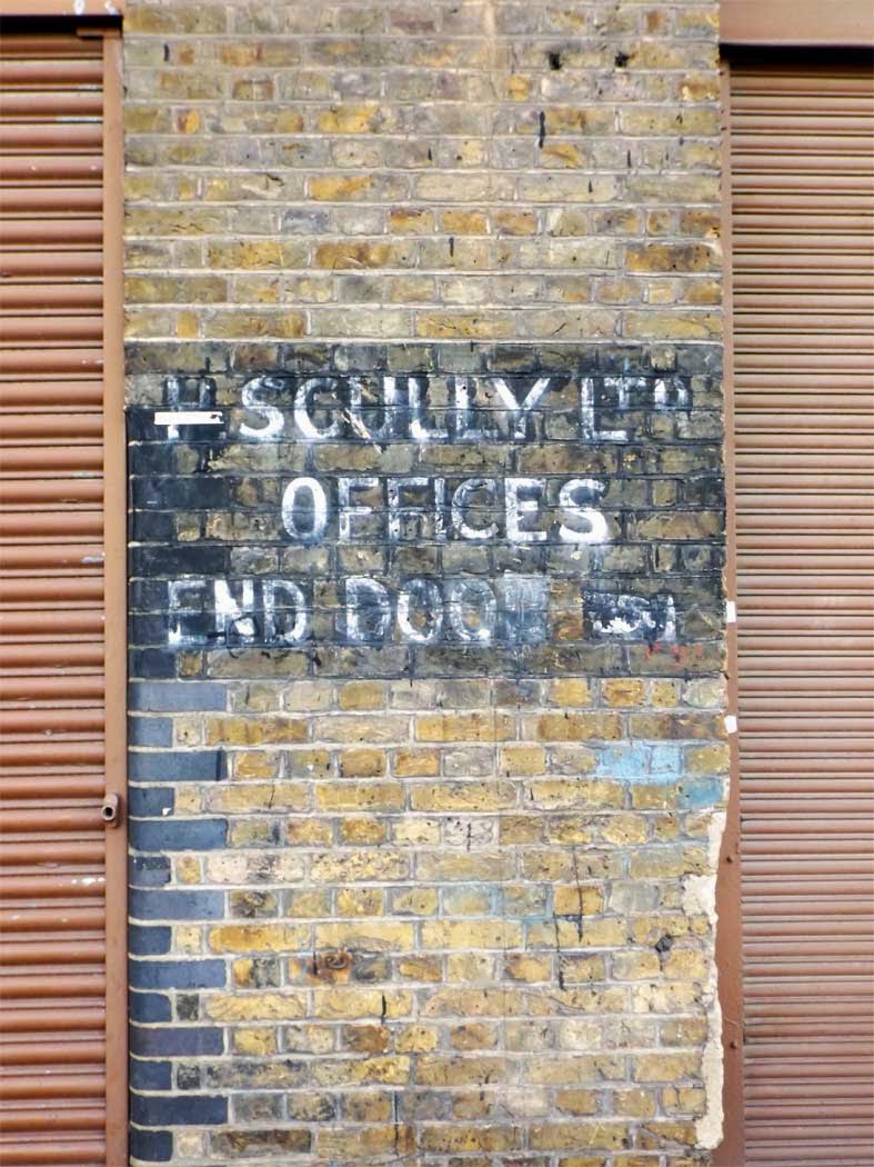
While making a beeline to the Crate Brewery in Queen's Yard (it was the tractor beam again) I spied a small ghost sign next to some warehouse doors. Despite my best efforts I've been unable to trace the buildings original occupants, H Scully Ltd, beyond that they were still trading here as recently as the 1960's. There's a great image of their warehouses taken in 1971 on David Christies Flickr page, featuring some considerably larger painted signs. Check it out here.
Although it provides an intriguing hint into the area's past, the sign's typography is fairly standard. However, it does have the distinction of being the first I've found to feature a manicule (pointing hand symbol, bottom right corner) though this is heavily faded now. A nice touch of detail nevertheless!
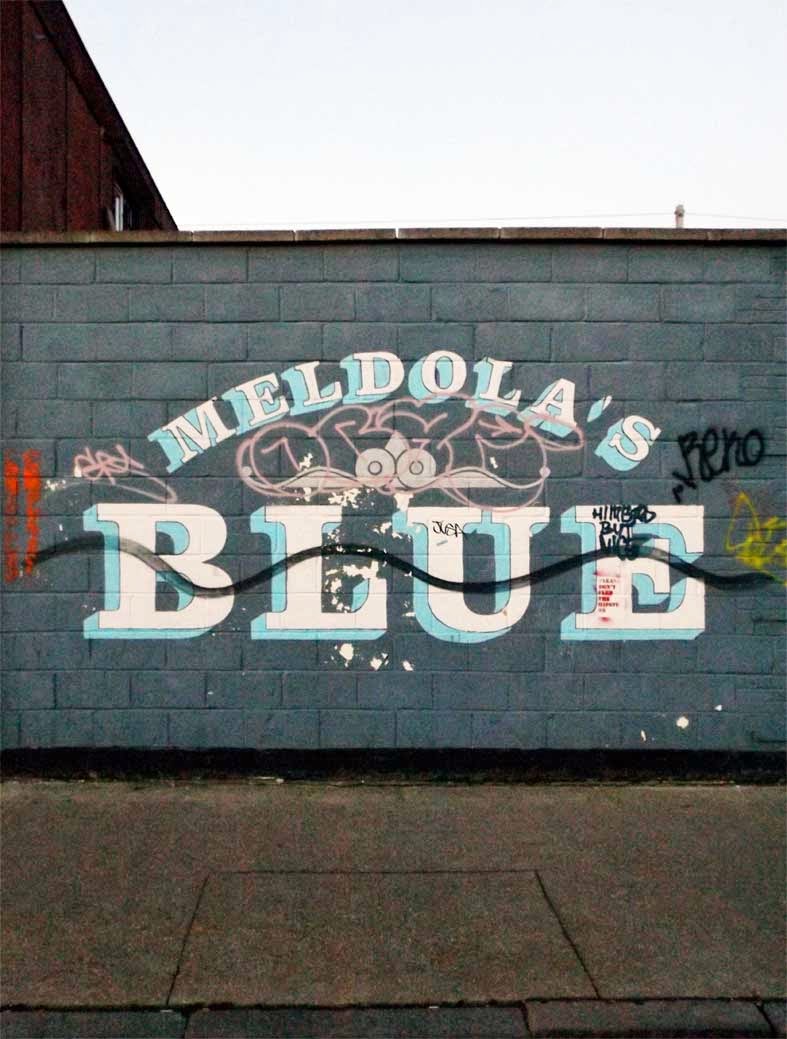
On the way back to the station after an hour or two in the brewery bar we walked by this fantastic pair of modern murals painted by Bread Collective as part of their 'The Walls Have Ears' project - a celebration of important aspects of the Wick's history.
The Cut refers to the Hackney section of the Lee Navigation canal, known locally as the Hackney Cut, while Meldola's Blue is the name of a famous dye invented here by Raphael Meldola in the late 19th century. Used as a pigment for paints, papers and textiles, Meldola's Blue was a highly significant discovery and is still widely used today.
It's great to see an art project that aims to educate people about local history in a contemporary way. It's a shame that these murals have been marked by graffiti, but as the final picture of the day proves, it really is difficult to avoid this in Hackney Wick.
The Lord Napier is a former pub next to the Overground station that according to Closed Pubs can be traced back to at least 1874. Over the years it was owned by Ind Coope and Taylor Walker before becoming a freehouse in 1991 and closing for good in 1995.
Although it has remained largely empty ever since the Napier has become a bit of a landmark in the local area with it's ever changing roof to pavement covering of impressive street art. Occasionally home to squatters, raves and pop up exhibitions, the Napier isn't completely dead but it seems a real shame that there hasn't been an attempt to revive it in recent years.
The pubs wooden signage can still be seen behind the layers of paint but really this place is all about the manic paintings. Although it has stopped dispensing pints, The Lord Napier instead provides Hackney Wick an ever evolving canvas that brings soul and colour to the neighbourhood. It also serves as a fitting end to a great day out through some of East London's most contrasting areas.
So until next time, thanks for reading!
PS: David Christie has a great Flickr gallery on the Lord Napier, be sure to check it out here.

