Stoke Newington or 'Stokey' to the locals is a district in the London Borough of Hackney. The area has been settled since medieval times, when it was a small village a few miles from London used mainly as a stop for travellers heading north. Nowadays it is well and truly a part of the city, though it is renowned for retaining some of its village character with a large array of open spaces and a bustling town centre.
Over the last century Stokey has seen its fair share of action, from being heavily bombed during World War Two through to significant urban regeneration in the last twenty years. Nowadays it plays home to a diverse and vibrant community as well as some of the most famous ghost signs in London. With the latter in mind, I headed over on a grey Saturday morning with my camera at the ready.
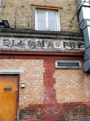
After arriving at Stoke Newington overground station I headed left and up the high street. It wasn't long before the first find of the day presented itself, a peeling ghost sign tucked away on the side of a light industrial building. As the sign says, this was the former home of Elloma Preparations Limited, who according to Companies House were a firm active from 1947 until 1996. Exactly what they were preparing remains a mystery.
Due to its length it was difficult to fit the sign into one shot, at least for an amateur like me. From what i've managed to capture the lettering looks to have been painted in a bold grotesque typeface, though most of the details have suffered significant fading over the years.
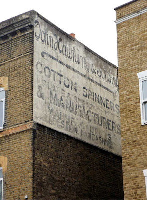
Continuing up the high street it quickly became apparent why the area is so renowned by ghost sign hunters with the appearance of a lovely example for John Hawkin & Sons, a Lancashire cotton spinning firm. The company had quite a few locations in London and if you want to know more about them, I highly recommend the London Road Croydon blog's excellent article here.
The type is a mixture of a playful, upright script with a very lovely ampersand and some clean sans-serif faces for good measure. Most of it is still readable and you can just make out the remnants of an earlier sign coming through here and there.
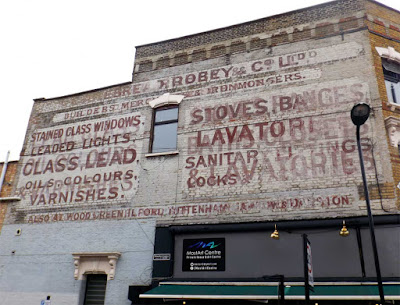
On the other side of the street, a building on the corner of Tyssen Road features an enormous sign belonging to the firm of Cakebread Robey & Co, providers of a rather extensive range of hardware services. Famed for their stained glass in particular, numerous examples of the company's work can reportedly still be found in pubs and churches around the South East.
A striking combination of white and red, the sign itself is an example of a palimpsest, a term which in this case means a sign painted on top of an older one. The lettering isn't especially decorative but the overall layout and the use of different sized panels gives it plenty of character. Anyway, who needs fancy serifs and swashes when you've got a massive bleedin' wall?
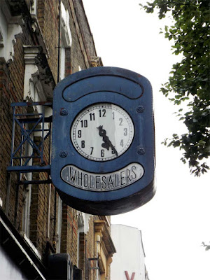
Further up the high street this rather striking blue clock hangs on above the pavement, a remnant from a time when advertising your business with a giant public timepiece was the done thing. Sadly, the name of the firm responsible has disappeared, leaving us with only the word 'wholesalers' and a clock face frozen at twenty-five past five.
The lettering is a light condensed sans serif with a touch of art deco style, arranged on a curve. If you half close your eyes, the whole thing looks a bit like a cyclops sporting a big toothy grin. Or maybe it's just past my bedtime.
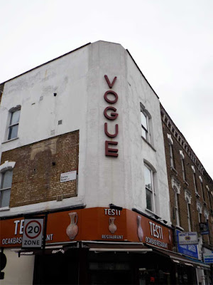
Next up is the former home of the Vogue cinema, which still retains its original 1940's signage on a chamfered wall. According to Cinema Treasures excellent article, the venue opened as the Majestic in 1920 before being renamed Vogue in the forties. In 1958 it was closed, and lay derelict for 42 years before being refurbished as a restaurant and flats at the turn of the millennium. During this period of disuse it was thought to be the longest closed cinema building in London. I can only imagine how exciting it would have been to get inside and photograph it during this time.
The lettering is in a stylish sans serif that is similar to Futura, judging by the very specific G. However, the lower crossbar on the E suggest that it may have had some customisation. Either way it's a great piece of history and kudos is due to the owner for preserving it.
After crossing the road and starting to head back this charming hand-painted sign caught my eye. The delicate italic lettering features high contrast thicks and thins as well as flowing, soft serifs that enhance the polite authority of the message. If I'd had my bike with me, I would have been walking by now.
On nearby Victorian Road I came upon the grand gateway to Coronation Avenue, crowned with some fantastic ornamental lettering. Featuring a flamboyant kick descending from the uppercase A and extended serifs on the N's, this is a typically Victorian style and one that I never tire of.
Although a peaceful looking gated community today, Coronation Avenue has known its share of tragedy, being directly hit by a bomb in World War Two that killed as many as 170 people. A harrowing first hand account of that fateful night can be found here, and serves as a stark reminder of dark times in the not too distant past.
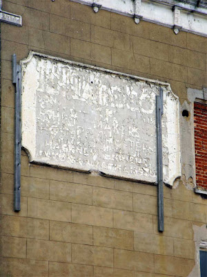
Continuing back down the high street, I spied this almost unreadable ghost sign high on the side of a building. Painted in a purpose built decorative panel, there's not much that can be said about the type but according to the Spitalfields Life's excellent article, it is an advert for Richardson & Sons Shirtmakers of Hackney, Leyton and Walthamstow, painted around 1955.
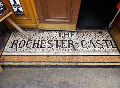
Nearby, the Rochester Castle pub provided the first mosaic of the day. The colour scheme of brown and gold is a good match for the fittings of the pub and the lightly serifed type has some great decorative touches including a double crossbar on the A and extended tails on the R's.
According to owners J D Wetherspoon, the pub itself was built in 1801 by Richard Payne, who was originally from Rochester. Prior to that, the site was home to another inn called the Green Dragon which had occupied the space since at least 1702. The Rochester is also noteworthy for being the longest held premises in the company's portfolio, being purchased by the chain as far back as 1983.
Across the road, a Georgian style building set back from the street features a very faint ghost sign for the original owners: none other than Marks & Spencer, the famous department store. Now home to a branch of Sports Direct, the fortunes of this building seem to have declined slightly since its construction in the 1930's, however its well preserved exterior lends a touch of faded glamour to the street.
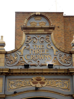
As it was getting on for lunchtime the Three Crowns pub was next to catch my eye with its beautifully elaborate side entrance, painted in an regal combination of blue and gold. The decorative carving features the pub name written in some tightly spaced lettering that's not too flashy, but boasts elegant flared serifs and a satisfying curved crossbar on the N.
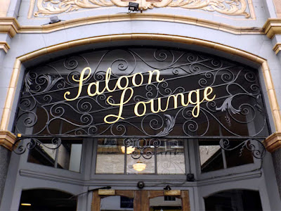
The side entrance is also home to some fantastic ironwork featuring the words 'Saloon Lounge' picked out in a neat gold script. I love the way the type and ornaments intertwine here and the angled lines are a great touch. The only thing that lets it down is the dodgy kerning between the L and the O that you could drive a truck through. My inner designer screams in terror, while the realist in me reckons that I ought to get out more.
At this point I nipped through this wonderful doorway and into the pub, so it seems like a good place to finish part one. If you made it this far, thanks for reading and look out for part two coming next week. Cheers!

