Earlier in the year we headed down to Brighton for a weekend by the sea. As it happened we spent more time getting lost in the maze of streets around the city centre than on the beach, but the amount of great type on offer (not to mention the pubs, markets and galleries) made the diversion worthwhile.
After parking in Regency Mews and walking up Preston Street the first find of the day presented itself. Located in a shop doorway, these earthy coloured tiles feature little hints of a decorative typeface that's almost completely faded away.
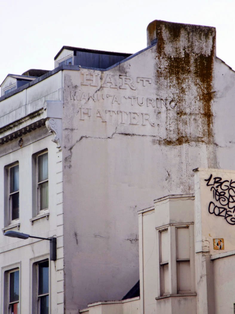
Heading into town presented an opportunity to test the zoom lens after spotting some raised lettering high on the side of a North Street building. According to Photo History Sussex, Hart Manufacturing Hatter was founded in the 1850's, meaning the type itself could be over 150 years old. Pretty good going considering its exposed location. The lettering seems to be a mixture of three typefaces, a Clarendon-style slab serif, a regular grot and a more formal serif.
Our next stop was the North Laine conservation area, a network of narrow streets that was once home to a busy community of traditional workshops and businesses. Nowadays it's packed full of antique markets, boutique shops, exotic eateries and trendy pubs, but amidst all this chaos plenty of great old type survives to tell the stories of some former inhabitants.
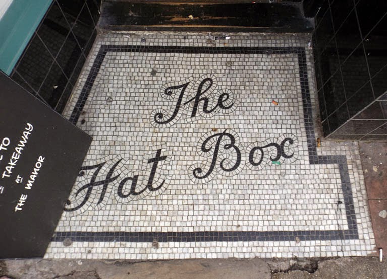
In the doorway of what is now a hairdressers this quirky mosaic marks the former home of a milliners shop. The information available on Geograph tells us that The Hat Box was in business here between 1911 and 1940. The mosaic features script lettering with extended swashes and rounded terminals on the capitals that give off an informal, friendly vibe. A great example of a preserved mosaic and the first of many to come.
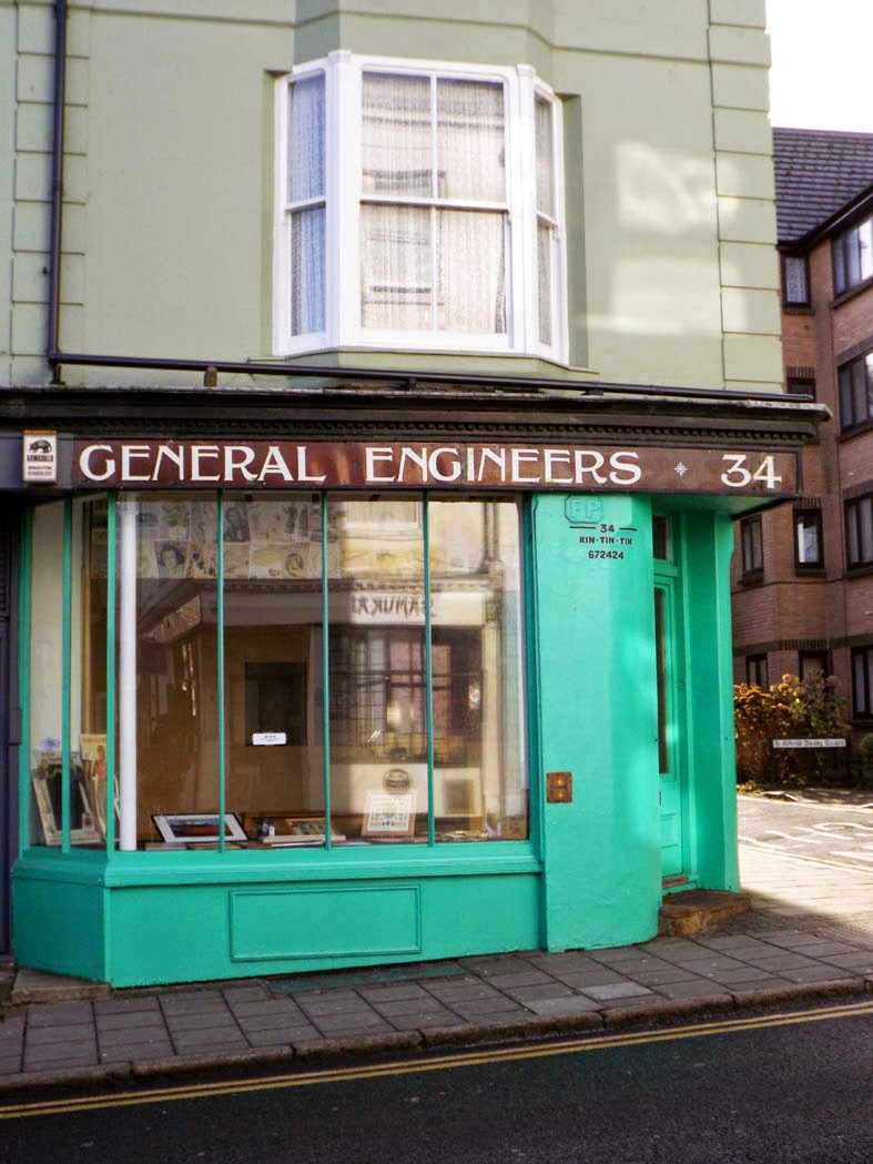
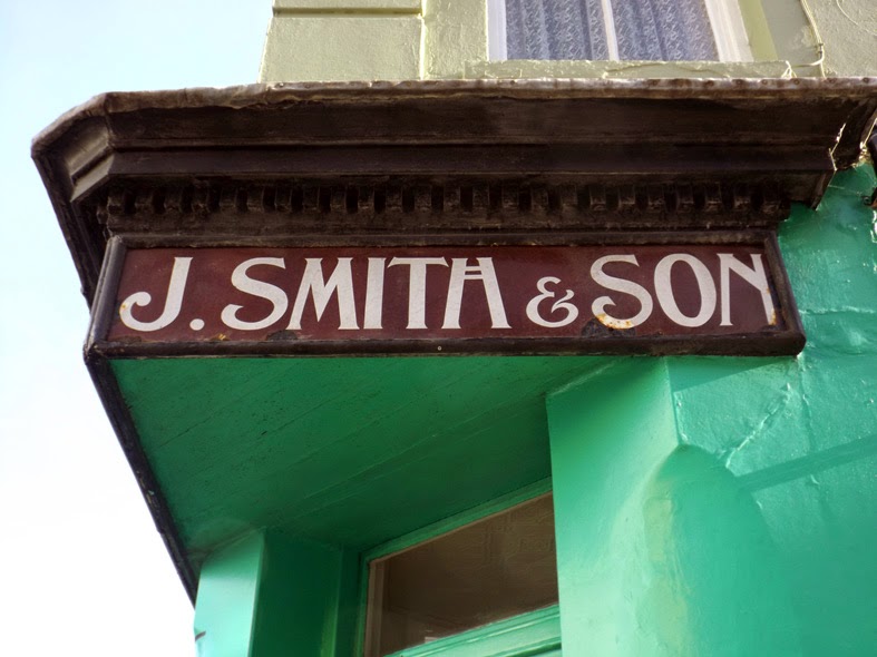
On North Road, the brightly coloured shopfront of no.34 features a brilliant hand painted sign for J.Smith, General Engineers. For the last 30 years this shop was the home of Rin Tin Tin, a antiques shop run by former graphic designer Rick Irvine which sadly closed in late 2014. According to the Brighton Argus, Rick uncovered the sign for the previous business during some decorating work and loved it so much he decided to display it permanently.
It's easy to see why this stunning sign was kept in place with its decorative Rennie Mackintosh inspired type. The double crossbar on the H, the ampersand with it's cheeky swash and the rounded terminal on the J are all great features and look fantastic against the burgundy background.
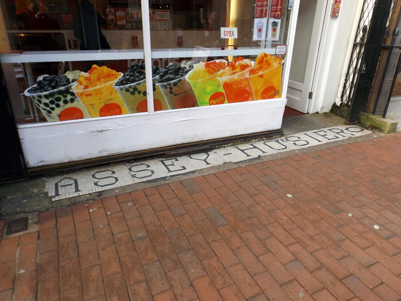
At the top of Gardner street a triangular grid mosaic for "Assey - Hosier" remains in place outside what is now a juice bar. A look at the My Brighton and Hove website reveals that the full name of the business was Cassey Hosiers, run by Herbert and Daisy Cassey from around 1905 to sometime in the 1960's.
The typeface has a unique, angular character and sharp serifs. Set on a rigid square grid, it has a slight Latin feel and is certainly nothing like the mosaic type I'm used to seeing. Interestingly, graphic designer Joe Porter recently developed a full typeface from these characters called Hosier. It's an excellent piece of work and I'm sure the Cassey's would have been pleased to know their shopfront is still being admired today.
Next door to Cassey's lies another mosaic, marking the former premises of one of Brighton's oldest trading families. According to My House My Street John W Terry established a bakery here in the 1840's which survived for 20 years. His son then founded a watchmakers that operated from 1870 all the way up until the 1980's, bringing the family's total to over 140 years on Gardner Street. Not bad!
As the mosaic belonged to the watchmaking business it's safe to assume that it's at least 100 years old. Despite this, the elegant script tiles remain in good shape and now serve as a reminder of the Terry family's legacy.
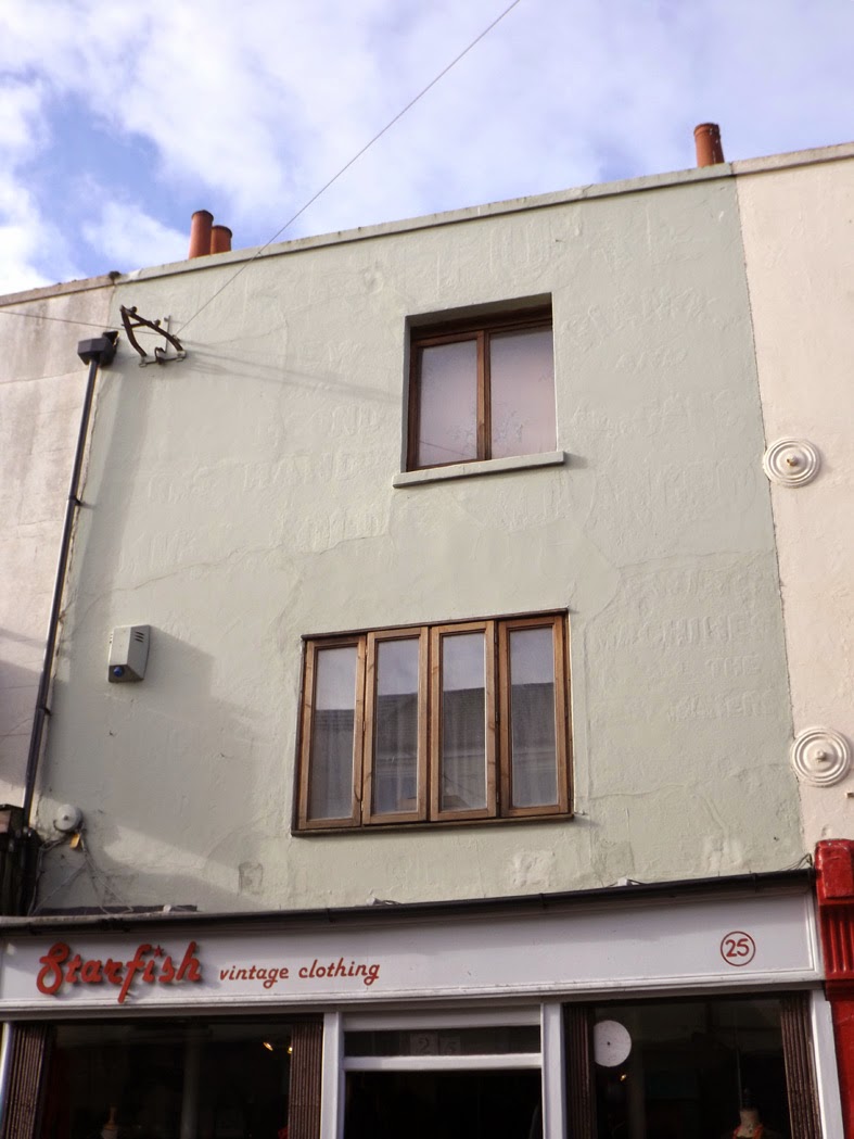
Having seen so many great pieces of preserved type so far it seems an even greater shame that further down Gardner Street, two buildings worth of painted signs have been cruelly covered with a coat of drab grey paint. If you look closely it's possible to make out lettering all over the face of the building which continues onto the next. Quite why anyone would want to cover these old painted signs is beyond me, and as such these buildings are the only black mark in what is otherwise a wonderfully preserved part of town.
On nearby Bond Street, a Sass and Belle shop now resides in the former Wheat Sheaf Inn. According the My Brighton and Hove, The Wheat Sheaf traded from the mid 1800's to sometime in the 1970's, though some sources state that it could have been in business as early as 1800. All that remains now is some debossed lettering on the front of building in a nicely spaced grot typeface, though at least the owners had the good sense to leave this in place.
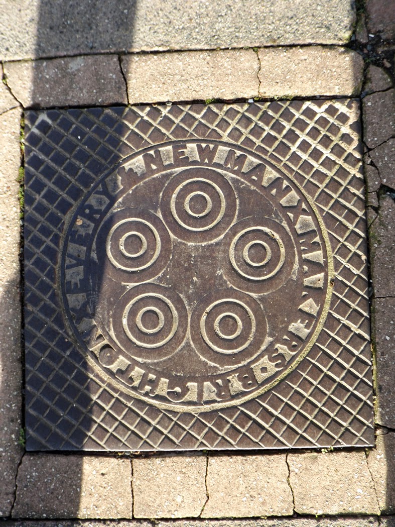
It certainly wouldn't be a good type hunt without some coal hole covers and the North Laine area has plenty. The most common is the design above, produced by T.W Porter's Star Foundry who were based in nearby Church Street until the early 1900's. There are also quite a few examples of the design below, produced by Every & Newman. Both feature fairly crude-cut grot typefaces, leading me to believe they might be a bit older than some of the more elaborate designs found elsewhere in the city.
Leaving the North Laine area and heading into the centre of Brighton we passed the Theatre Royal, a grade two listed building and one of the oldest theatres in the country, being built in 1807. Although the building itself is impressive it was the peeling lettering on its side that caught my attention, a bold condensed typeface designed to be legible all the way down New Road.
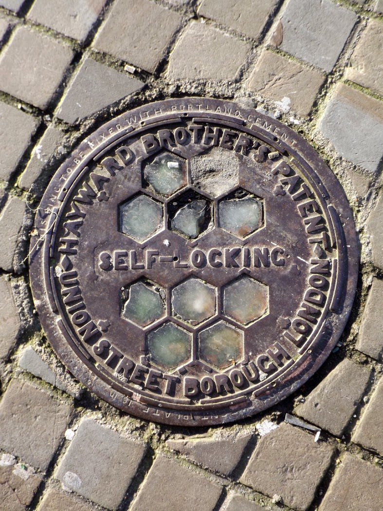
After a wander through Victoria Gardens we headed towards North Street, where I just had time to grab a shot of this coal hole cover. Produced by Hayward Brothers of London, it features two rings of type and glass panels to illuminate the storage room below. A more complex design than the examples from earlier in the day, it appears to have aged better despite being in heavily pedestrianised area. The Faded London blog has a fantastic history of Hayward Brothers and coal holes in general, be sure to check it out here
At this point we stopped for a much needed pint so it seems like the ideal place to finish the first part of our type hunt around Brighton. Thanks for reading and look out for part two in the next few days.
Cheers!








No comments:
Post a Comment