In the first part of our walk around Brighton we explored the North Laine area which proved to be a treasure trove of great typography. You can check out the original post here. After stopping for a quick pint and something to eat we headed towards Kemptown to continue the day's exploration.
On the way up St James street we passed a tall, rounded building featuring raised sans serif lettering that reads "Kemp Town Brewery Entire". According to the Brewery History website this was a pub rather than a brewery, known at the St James Tavern and owned by Kemp Town Breweries Ltd who became part of Charringtons in 1963. Although it's unclear when the pub closed, the building has been the home to Brighton's oldest gay venue, The Bulldog, since 1979.
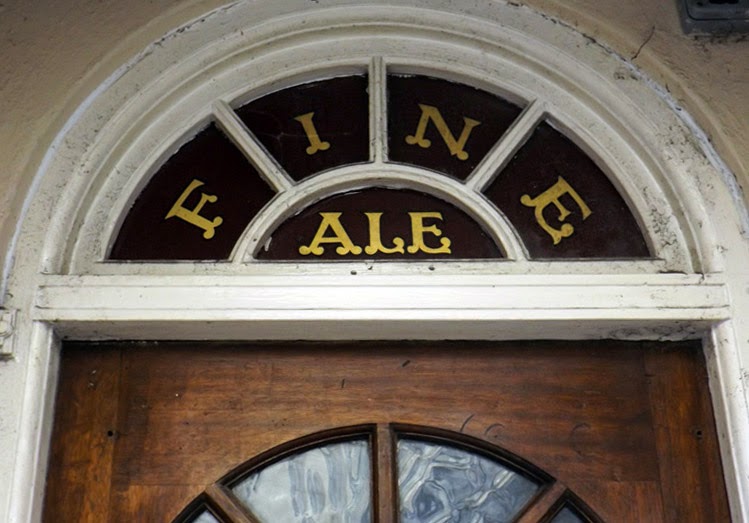
Above the domestic looking doorway of the Bulldog another trace of the former St James Tavern can be seen in this decorative lettering on the fanlight glass. The rounded terminals and sharp serifs of the type have some circus poster influence, feeling friendly and inviting. I can only hope that the Bulldog continue to fulfil the promise of fine ale inside.
After continuing up St James Street we arrived in Kemptown, a mostly residential part of town that just happens to have a great selection of old pubs, a microbrewery and more antique shops than you could shake a jewel-encrusted cane at.
On the corner of Upper St James street a tall, grey building features some raised lettering above a doorway in a condensed sans font. According to Wikipedia St John the Baptist's school was located here from 1850 to 1989 and like many schools of it's time featured separate entrances for boys and girls. The building is now rather empty looking, with the girls entrance lettering remaining as the only sign of its former use.
After a few hours in Kemptown we retraced our steps back into town toward The Lanes, a historic maze of narrow alleyways that was once the heart of Brighton's old fishing town. Although now home to a a mix of antique, jewellery and designer shops, The Lanes retain loads of authentic character and is a must-see when visiting the city.
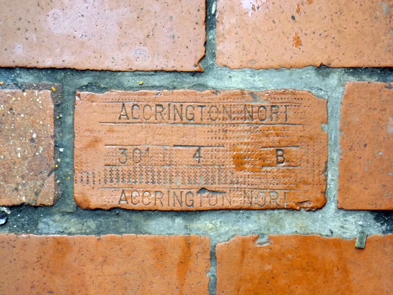
Naturally, I was too busy looking at the floor to notice the shops and couldn't resist stopping to snap part of the walkway that featured a brick with the original makers mark of Accrington Nori, a well known Lancashire brick works that is still in operation today. Famed for their strength, Nori's bricks were used in the construction of landmarks such as the Empire State Building and the Blackpool Tower.
According to legend, the name 'Nori' came from an unintentional backwards spelling of the word iron. Although there's not a lot to say about the type here, I thought this was an unusual piece of history and a great find tucked away in one of Brighton's oldest streets.
According to legend, the name 'Nori' came from an unintentional backwards spelling of the word iron. Although there's not a lot to say about the type here, I thought this was an unusual piece of history and a great find tucked away in one of Brighton's oldest streets.
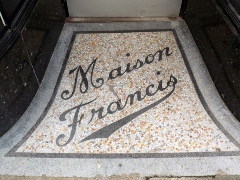
Heading back along Western road later in the day we passed the doorway to no.26 which features some eye catching script type. According to the My Brighton and Hove group
Maison Francis was a ladies hairdresser first listed in the Kelly's
directory of 1948, though it may have been trading much earlier than
this. The script letter forms are beautifully drawn, especially the uppercase M with its loops and curls and the F with its extended swash. The dynamic, baseball-style underline extending from the lowercase S finishes the whole thing off with a bit of flair.
Above the Paris House pub at 21 Western Road an ornate mosaic for the old Western Hotel survives in remarkably good condition. The pub here has had many names over the years and according to Portslade History's excellent article it was known as the Western Hotel from 1854 to sometime in the 1920's.
The mosaic itself is a stunning piece of work with a still-vibrant colour palette of gold, blue, brown and green. The type is full of flamboyant 19th century style, big swashes on the capitals, decorative cross bars and ornamental serifs abound. I'm a sucker for type on a curve and I think it works well here, giving room for the ornamental elements to fill out the rest of the space in a suitably swirly fashion.
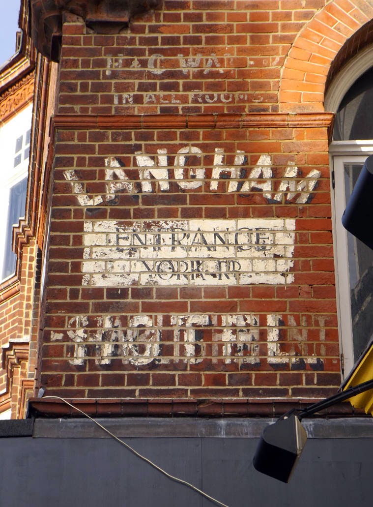
On the other side of Western Road, right on the boundary between Brighton and Hove, a painted sign for the Langham Hotel can be found on the side of an elegant red brick building. I've not been able to find out much about the Langham, though it does appear to still be in business. The sign helpfully tells us that it offers "H&C WATER IN ALL ROOMS", which is always handy.
Though heavily worn the sign is still legible and features some chunky arched sans serif type with a heavy black drop shadow for good measure. Looking closely it seems that the word "HOTEL" was painted over another word at some point, though it's difficult to make out exactly what this says.
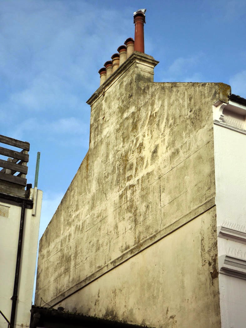
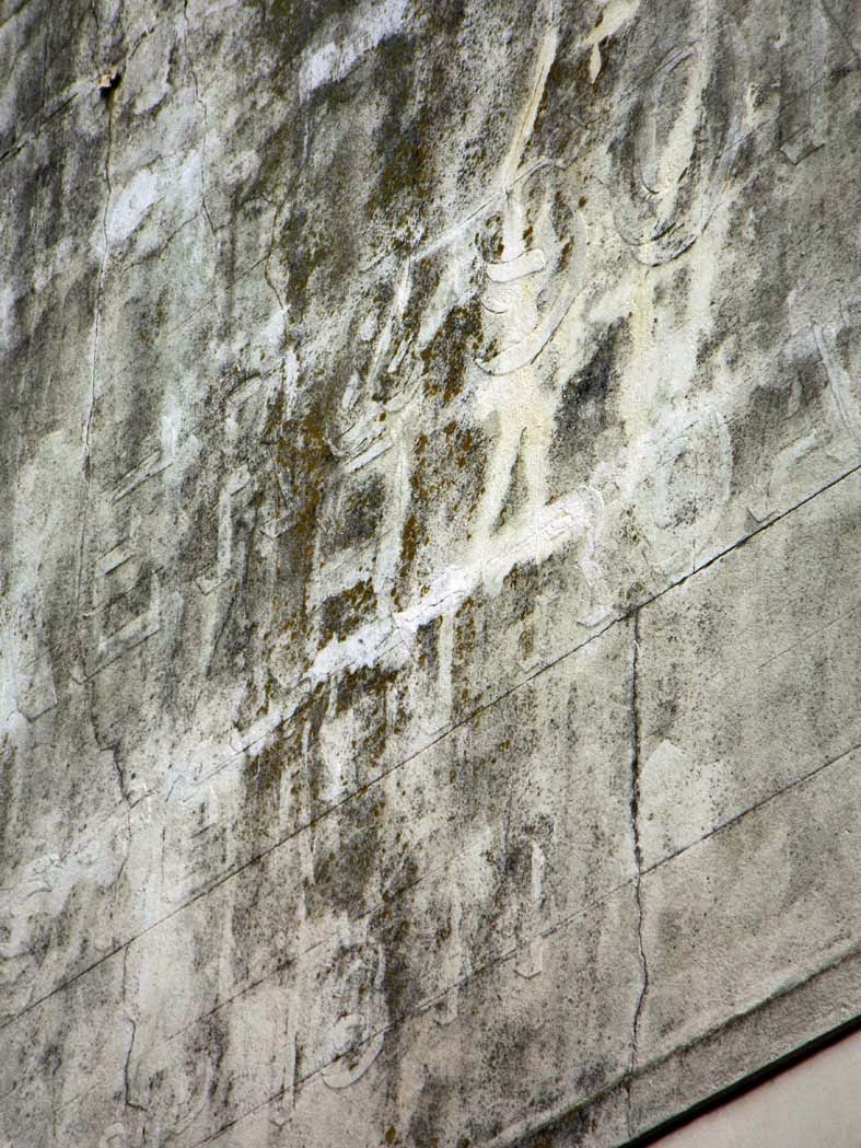
On a street just off Western Road the faint outline of letter forms can just about be made out in the dirty whitewash on the side of this residential building.
Looking closely, I can just about read "ER & SONS" in a bold sans font but it's difficult to manage anything beyond that. It's a shame to see another example of a painted sign that's been covered over, especially as it looks to have been a large one with a quite a few lines of type.
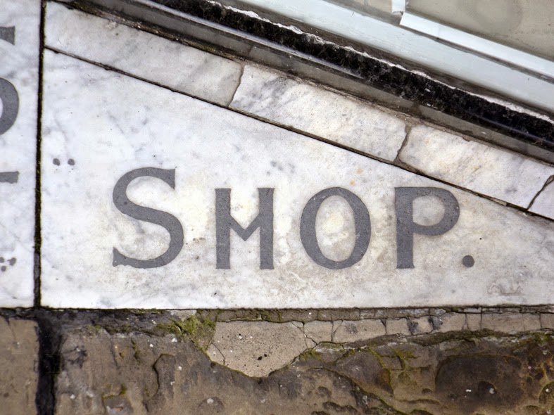
The final find of the day was this typographic marble flooring for Lea & Sons Famous Blouse Shop, tucked away just off Western Road on Preston Street. According to the excellent Through the Eyes of a Brighton Girl website, Lea & Sons opened here in 1914, selling blouses and hats before later becoming a drapers and closing for good in the 1950's.
The elegant shopfront looks a bit empty these days, though it's easy to imagine it being quite sophisticated in it's time. It seems that someone has tried to cover the central panel of the decorative floor though fortunately the letter forms are still easily legible.
A closer look at some of the characters reveals some quirky features such as the v-shaped crossbars on the H and A, and in the photo below some slight serifs can be seen on the uppercase S. All in all a classy composition that's just begging to be restored to its former glory.
As we headed back to the hotel I was left with an overall impression of Brighton as a city that has embraced it's heritage, injecting fresh life into its historical areas and enabling them to be appreciated by new generations. This can be seen in the preservation of the North Laine area (see part one), the thriving markets of The Lanes and the fantastic range of characterful pubs, many of which proudly retain their original interior fixtures.
Instead of being ripped up or covered over, many subtle traces of the past are waiting to be discovered in doorways, high on the side of buildings and on the pavement underfoot. The feeling that I've only scratched the surface of these was confirmed after spotting another handful of great examples when driving home the next morning. There's definitely unfinished business for me here and next time I might even make it as far as the beach.
Once again thanks are reading Urbantyping and feel free to add comments or criticisms below. Cheers!






No comments:
Post a Comment